library(tidymodels)
library(embed)
library(GGally)
library(ggrepel)
library(kernlab)
library(dimRed)
library(RANN)18 Dimensionality reduction
Load the packages we need for this chapter.
Load the penguin dataset.
penguins <- modeldata::penguins %>% drop_na()18.1 Principal component analysis (PCA)
The recipes and embed packages have several implementations of principal component analysis (PCA).
step_pca: classical PCA analysis that calculates all principal componentsstep_pca_truncated: classical PCA analysis that calculates only the requested number of componentsstep_pca_sparse: in PCA all predictors contribute to the principal components and will have non-zero coefficients; sparse PCA can produce principal components where not all predictors contribute (zero coefficients)
18.1.1 PCA
The step_pca (or step_pca_truncted) function converts numeric predictors to principal components as part of a recipe. We first define the recipe and then use prep and bake to get the transformed data.
pca_rec <- recipe(data = penguins, formula = ~ .) %>%
  step_normalize(all_numeric_predictors()) %>%
  step_pca(all_numeric_predictors())

penguins_pca <- pca_rec %>%
  prep() %>%
  bake(new_data = NULL)
Figure 18.1 shows the first two principal components. We can see that the gentoo species is well separated from the other two by the first principal component. A combination of the first and second principal component separates chinstrap and adelie with some overlap.
penguins_pca %>%
  ggplot(aes(x = PC1, y = PC2, color = species, shape = species)) +
  geom_point()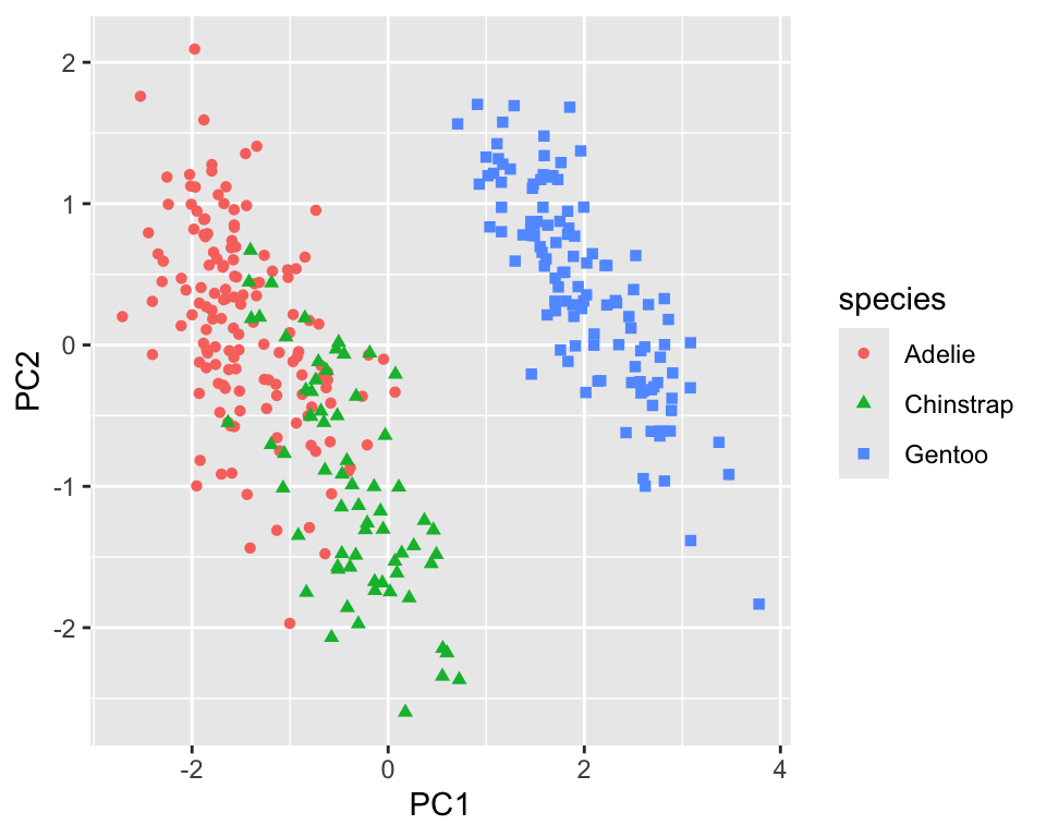
The step_pca function labels the principal components by default using PC1 for the first principal component, PC2 for the second, and so on; this is a common convention.
A PCA analysis usually also includes looking at the variance of the original dataset explained by the principal components. You have two options to extract this information from the prep-ed recipe. The first accesses the fitted PCA model from prcomp.
prep_pca_rec <- pca_rec %>% prep()

# Access the object from the underlying engine
summary(prep_pca_rec$steps[[2]]$res)
Importance of components:
PC1 PC2 PC3 PC4
Standard deviation 1.6569 0.8821 0.60716 0.32846
Proportion of Variance 0.6863 0.1945 0.09216 0.02697
Cumulative Proportion 0.6863 0.8809 0.97303 1.00000While this is a reasonable approach, you might want to use the actual values for visualizations. In this case, we can use the tidy function. Figure 18.2 shows a scree plot created using these data.
explained_variance <-  tidy((pca_rec %>% prep())$steps[[2]],
  type = "variance")
perc_variance <- explained_variance %>%
  filter(terms == "percent variance")
cum_perc_variance <- explained_variance %>%
  filter(terms == "cumulative percent variance")

ggplot(explained_variance, aes(x = component, y = value)) +
  geom_bar(data = perc_variance, stat = "identity") +
  geom_line(data = cum_perc_variance) +
  geom_point(data = cum_perc_variance, size = 2) +
  labs(x = "Principal component", y = "Percent variance")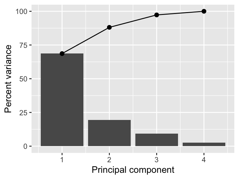
Another informative graph is a biplot.
pca <- pca_rec %>%
  prep()
loadings <-  tidy(pca$steps[[2]], type = "coef") %>%
  pivot_wider(id_cols = "terms", names_from = "component",
    values_from = "value")
scale <- 4
penguins_pca %>%
  ggplot(aes(x = PC1, y = PC2)) +
  geom_point(aes(color = species, shape = species)) +
  geom_segment(data = loadings,
    aes(xend = scale * PC1, yend = scale * PC2, x = 0, y = 0),
    arrow = arrow(length = unit(0.15, "cm"))) +
  geom_label_repel(data = loadings,
    aes(x = scale * PC1, y = scale * PC2, label = terms),
    hjust = "left", size = 2)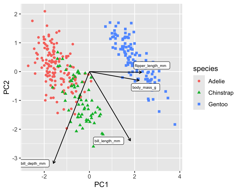
The biplot in Figure 18.3 shows the PCA loadings, the cofficients of the linear combination of the original variables, overlaid onto the scatterplot of the transformed data. The loadings are shown as arrows and tell us that PC1 is mainly a linear combination of flipper length and body mass. PC2 is almost exclusively a linear combination of bill measurements.
18.1.2 Truncated PCA
Truncated PCA can be used if not all the components are needed. The result is identical to the normal PCA (see Figure 18.4). It is particularly useful for larger datasets as the computation will be faster.
pca_rec <- recipe(data = penguins, formula = ~ .) %>%
  step_normalize(all_numeric_predictors()) %>%
  step_pca_truncated(all_numeric_predictors(), num_comp = 2)

penguins_pca <- pca_rec %>%
  prep() %>%
  bake(new_data = NULL)
penguins_pca %>%
  ggplot(aes(x = PC1, y = PC2, color = species, shape = species)) +
  geom_point()
18.1.3 Sparse principal component analysis (SPCA)
Even though PCA is independent of the dimensionality, high-dimensional datasets lead to principal components where each principal component is a linear combination of all the original variables. This makes it difficult to interpret the principal components. Sparse PCA is a method that creates principal components with sparse loadings. This is similar to what is happening in LASSO regression due to the L1 regularization. In fact, the sparse PCA problem can be reformulated as a LASSO problem (Zou, Hastie, and Tibshirani 2006).
The step_pca_sparse function from the embed package implements sparse PCA and can be used as a drop-in replacement for step_pca (see https://embed.tidymodels.org/reference/step_pca_sparse.html)
18.2 Kernel PCA
Kernel PCA is a non-linear extension of PCA. It uses a kernel function to map the data into a higher-dimensional space where it is linearly separable. The kernel PCA is then performed in this higher-dimensional space. The recipes package has a step_kpca function that can be used to perform kernel PCA. It’s used in the same way as step_pca.
kpca_rec <- recipe(data = penguins, formula = ~ .) %>%
  step_normalize(all_numeric_predictors()) %>%
  step_kpca(all_numeric_predictors(), num_comp = 2)

penguins_kpca <- kpca_rec %>%
  prep() %>%
  bake(new_data = NULL)

penguins_kpca %>%
  ggplot(aes(x = kPC1, y = kPC2, color = species, shape = species)) +
  geom_point()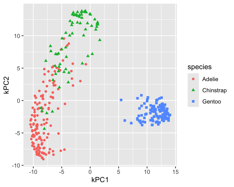
Figure 18.5 shows the resulting projection. In comparison to the linear PCA, the adelie and chinstrap species are better separated. The gentoo species is still well separated from the other two and more compact. To differentiate the kernel PCA result from PCA result, step_kpca labels the components using kPC1, kPC2, and so on. You can change the label prefix using the prefix argument.
The default for kernel PCA is to use the radial basis function (RBF) kernel. The step_kpca function has several other kernels implemented; see the kernlab package for more details. Figure 18.6 shows the resulting projection for kPCA using the polynomial kernel with degree 2. The projection is worse than the RBF kernel.
kpca_rec <- recipe(data = penguins, formula = ~ .) %>%
  step_normalize(all_numeric_predictors()) %>%
  step_kpca(all_numeric_predictors(), num_comp = 2,
    options = list(kernel = "polydot", kpar = list(degree = 2)))

penguins_kpca <- kpca_rec %>%
  prep() %>%
  bake(new_data = NULL)

penguins_kpca %>%
  ggplot(aes(x = kPC1, y = kPC2, color = species, shape = species)) +
  geom_point()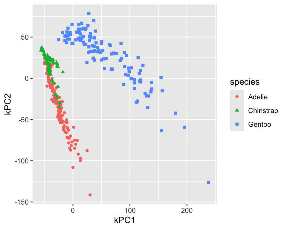
18.3 UMAP
UMAP is a non-linear dimensionality reduction technique that is based on manifold learning. It is similar to t-SNE but is faster and can be used for larger datasets. UMAP also has the advantage over t-SNE that it allows to project new data points into the existing projection.
The embed package has a step_umap function that can be used to perform UMAP in a recipe. The projection creates new variables called UMAP1, UMAP2, etc. Figure 18.7 shows the resulting projection. The adelie and chinstrap species are well separated. The gentoo species is still well separated from the other two and more compact.
umap_rec <- recipe(data = penguins, formula = ~ .) %>%
  step_normalize(all_numeric_predictors()) %>%
  step_umap(all_numeric_predictors(), num_comp = 2)

penguins_umap <- umap_rec %>%
  prep() %>%
  bake(new_data = NULL)

penguins_umap %>%
  ggplot(aes(x = UMAP1, y = UMAP2, color = species, shape = species)) +
  geom_point()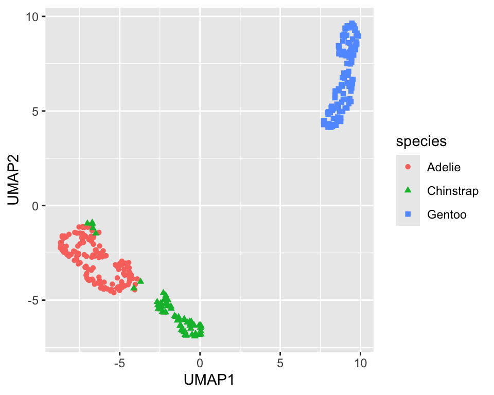
UMAP has several parameters that can be tuned. The min_dist (default 0.01) parameter controls how tightly the clusters are packed. Increasing the value leads to looser clusters Figure 18.8 shows the projection with min_dist=0.5. It is a good idea to explore the effect of the min_dist parameter on the projection.
umap_rec <- recipe(data = penguins, formula = ~ .) %>%
  step_normalize(all_numeric_predictors()) %>%
  step_umap(all_numeric_predictors(), num_comp = 2,
    min_dist = 0.5)

penguins_umap <- umap_rec %>%
  prep() %>%
  bake(new_data = NULL)

penguins_umap %>%
  ggplot(aes(x = UMAP1, y = UMAP2, color = species, shape = species)) +
  geom_point()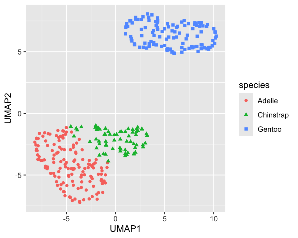
min_dist=0.5)
18.4 Isomap (multi-dimensional scaling, MDS)
Multi-dimensional scaling (MDS) is a family of dimensionality reduction techniques that tries to preserve the distances between the data points. Isomap is a version of MDS that uses nearest neighbors information to construct a network of neighbouring points and use this network to define a geodesic distance. which is then used in the mapping
The recipes package has a step_isomap function that can be used to perform Isomap in a recipe. The projection creates new variables called Isomap1, Isomap2, etc. Figure 18.9 shows the resulting projection.
isomap_rec <- recipe(data = penguins, formula = ~ .) %>%
  step_normalize(all_numeric_predictors()) %>%
  step_isomap(all_numeric_predictors(), num_terms = 2, neighbors = 100)

penguins_isomap <- isomap_rec %>%
  prep() %>%
  bake(new_data = NULL)
penguins_isomap %>%
  ggplot(aes(x = Isomap1, y = Isomap2, color = species, shape = species)) +
  geom_point()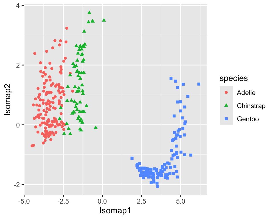
18.5 Partial Least Squares (PLS)
Partial Least Squares (PLS) was developed initialy not as a dimensionality reduction technique but as a regression technique. It is similar to PCA but instead of maximizing the variance of the principal components, it maximizes the covariance between the predictors and the response. The recipes package has a step_pls function that can be used to perform PLS in a recipe. The projection creates new variables called PLS1, PLS2, etc.
data <- datasets::mtcars %>%
  as_tibble(rownames = "car") %>%
  mutate(
    vs = factor(vs, labels = c("V-shaped", "straight")),
    am = factor(am, labels = c("automatic", "manual")),
  )

formula <- mpg ~ cyl + disp + hp + drat + wt + qsec + vs + am +
  gear + carb
pls_rec <- recipe(data = data, formula = formula) %>%
  step_normalize(all_numeric_predictors()) %>%
  step_pls(all_numeric_predictors(), outcome = "mpg", num_comp = 2)

mtcars_pls <- pls_rec %>%
  prep() %>%
  bake(new_data = NULL)
mtcars_pls %>%
  ggplot(aes(x = PLS1, y = PLS2, color = mpg, size = mpg)) +
  geom_point()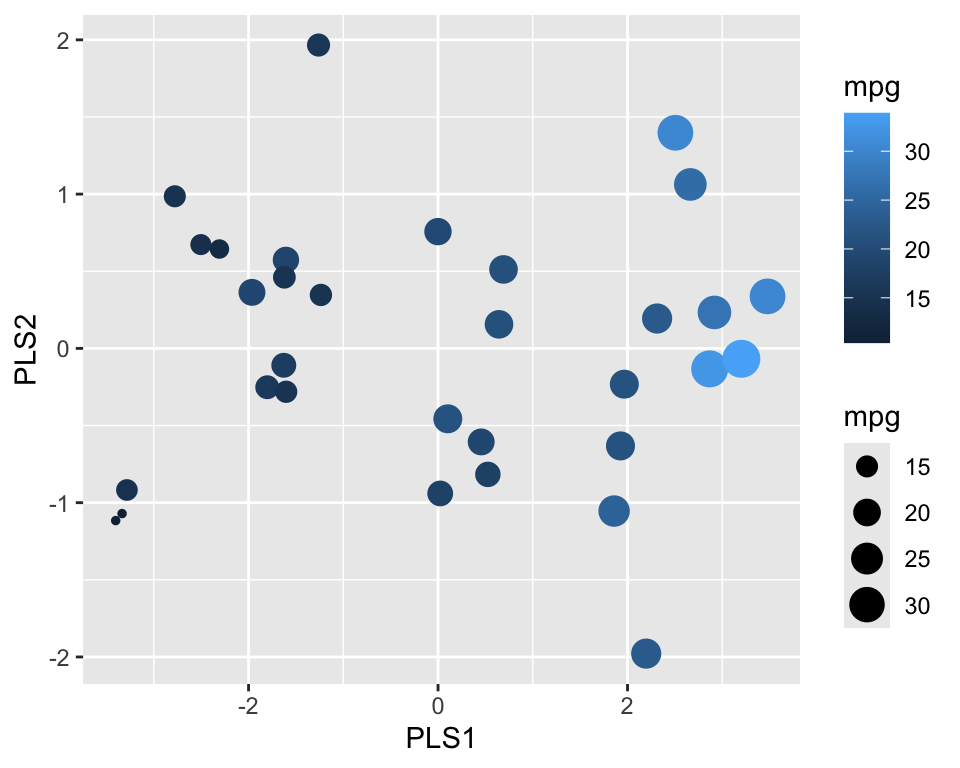
Figure 18.10 shows the resulting projection. We can see that PLS1 correlates well with the outcome.
NoteFurther information
- https://recipes.tidymodels.org/
recipespackage - https://embed.tidymodels.org/
embedpackage
Code
The code of this chapter is summarized here.
Show the code
knitr::opts_chunk$set(echo = TRUE, cache = TRUE, autodep = TRUE,
  fig.align = "center")
library(tidymodels)
library(embed)
library(GGally)
library(ggrepel)
library(kernlab)
library(dimRed)
library(RANN)
penguins <- modeldata::penguins %>% drop_na()
pca_rec <- recipe(data = penguins, formula = ~ .) %>%
  step_normalize(all_numeric_predictors()) %>%
  step_pca(all_numeric_predictors())

penguins_pca <- pca_rec %>%
  prep() %>%
  bake(new_data = NULL)
penguins_pca %>%
  ggplot(aes(x = PC1, y = PC2, color = species, shape = species)) +
  geom_point()
prep_pca_rec <- pca_rec %>% prep()

# Access the object from the underlying engine
summary(prep_pca_rec$steps[[2]]$res)
explained_variance <-  tidy((pca_rec %>% prep())$steps[[2]],
  type = "variance")
perc_variance <- explained_variance %>%
  filter(terms == "percent variance")
cum_perc_variance <- explained_variance %>%
  filter(terms == "cumulative percent variance")

ggplot(explained_variance, aes(x = component, y = value)) +
  geom_bar(data = perc_variance, stat = "identity") +
  geom_line(data = cum_perc_variance) +
  geom_point(data = cum_perc_variance, size = 2) +
  labs(x = "Principal component", y = "Percent variance")
pca <- pca_rec %>%
  prep()
loadings <-  tidy(pca$steps[[2]], type = "coef") %>%
  pivot_wider(id_cols = "terms", names_from = "component",
    values_from = "value")
scale <- 4
penguins_pca %>%
  ggplot(aes(x = PC1, y = PC2)) +
  geom_point(aes(color = species, shape = species)) +
  geom_segment(data = loadings,
    aes(xend = scale * PC1, yend = scale * PC2, x = 0, y = 0),
    arrow = arrow(length = unit(0.15, "cm"))) +
  geom_label_repel(data = loadings,
    aes(x = scale * PC1, y = scale * PC2, label = terms),
    hjust = "left", size = 2)
pca_rec <- recipe(data = penguins, formula = ~ .) %>%
  step_normalize(all_numeric_predictors()) %>%
  step_pca_truncated(all_numeric_predictors(), num_comp = 2)

penguins_pca <- pca_rec %>%
  prep() %>%
  bake(new_data = NULL)
penguins_pca %>%
  ggplot(aes(x = PC1, y = PC2, color = species, shape = species)) +
  geom_point()
kpca_rec <- recipe(data = penguins, formula = ~ .) %>%
  step_normalize(all_numeric_predictors()) %>%
  step_kpca(all_numeric_predictors(), num_comp = 2)

penguins_kpca <- kpca_rec %>%
  prep() %>%
  bake(new_data = NULL)

penguins_kpca %>%
  ggplot(aes(x = kPC1, y = kPC2, color = species, shape = species)) +
  geom_point()
kpca_rec <- recipe(data = penguins, formula = ~ .) %>%
  step_normalize(all_numeric_predictors()) %>%
  step_kpca(all_numeric_predictors(), num_comp = 2,
    options = list(kernel = "polydot", kpar = list(degree = 2)))

penguins_kpca <- kpca_rec %>%
  prep() %>%
  bake(new_data = NULL)

penguins_kpca %>%
  ggplot(aes(x = kPC1, y = kPC2, color = species, shape = species)) +
  geom_point()
umap_rec <- recipe(data = penguins, formula = ~ .) %>%
  step_normalize(all_numeric_predictors()) %>%
  step_umap(all_numeric_predictors(), num_comp = 2)

penguins_umap <- umap_rec %>%
  prep() %>%
  bake(new_data = NULL)

penguins_umap %>%
  ggplot(aes(x = UMAP1, y = UMAP2, color = species, shape = species)) +
  geom_point()
umap_rec <- recipe(data = penguins, formula = ~ .) %>%
  step_normalize(all_numeric_predictors()) %>%
  step_umap(all_numeric_predictors(), num_comp = 2,
    min_dist = 0.5)

penguins_umap <- umap_rec %>%
  prep() %>%
  bake(new_data = NULL)

penguins_umap %>%
  ggplot(aes(x = UMAP1, y = UMAP2, color = species, shape = species)) +
  geom_point()
isomap_rec <- recipe(data = penguins, formula = ~ .) %>%
  step_normalize(all_numeric_predictors()) %>%
  step_isomap(all_numeric_predictors(), num_terms = 2, neighbors = 100)

penguins_isomap <- isomap_rec %>%
  prep() %>%
  bake(new_data = NULL)
penguins_isomap %>%
  ggplot(aes(x = Isomap1, y = Isomap2, color = species, shape = species)) +
  geom_point()
data <- datasets::mtcars %>%
  as_tibble(rownames = "car") %>%
  mutate(
    vs = factor(vs, labels = c("V-shaped", "straight")),
    am = factor(am, labels = c("automatic", "manual")),
  )

formula <- mpg ~ cyl + disp + hp + drat + wt + qsec + vs + am +
  gear + carb
pls_rec <- recipe(data = data, formula = formula) %>%
  step_normalize(all_numeric_predictors()) %>%
  step_pls(all_numeric_predictors(), outcome = "mpg", num_comp = 2)

mtcars_pls <- pls_rec %>%
  prep() %>%
  bake(new_data = NULL)
mtcars_pls %>%
  ggplot(aes(x = PLS1, y = PLS2, color = mpg, size = mpg)) +
  geom_point()