library(tidyverse)
library(patchwork)
library(GGally)
library(hexbin)3 Data visualization
The tidyverse package ggplot2 is a great way to create complex data visualization. It is based on The Grammar of Graphics by Wilkinson (Wilkinson 2005). The basic idea is that you can describe a graph in several layers:
- Data: the data that contain the variables to be visualized
- Aesthetics: mapping of data variables to visual properties (aesthetics) such as position, color, size, shape, etc.
- Geometries: the geometric objects that represent the data points such as points, lines, bars, etc.
- Facets: splitting the data into subsets and creating a separate plot for each subset
- Statistics: statistical transformations of the data such as smoothing, binning, etc.
- Coordinates: the coordinate system used for the plot such as Cartesian, polar, etc.
- Theme: control the visual appearance of the plot such as background color, grid lines, font size, etc.
While the package is conceptually founded on this grammar, you will see that there is no one-to-one correspondence. However, the ideas shine through when building plots.
3.1 ggplot2 — the basics
ggplot2 is loaded either with library(ggplot2) or library(tidyverse).
We also load the package patchwork which allows us to combine multiple graphs into a single figure.
Here is an example of a ggplot2 graph:
- 1
-
The
ggplotcommand creates a new plot. It combines the data and aesthetics layers. The first argument is the data frame, and the second argument is the mapping of data onto aesthetics. It maps the variables from the dataframe to the visual properties of the plot. In this case, we are mapping the variablewtto the \(x\)-axis and the variablempgto the \(y\)-axis. - 2
-
The
geom_pointcommand adds a scatter plot using the+operator. This corresponds to the geometries layer. In addition, we specify thecolorof the points. This overrides the default color aesthetic of the points from black todarkgreen. In the same way we changed the aesthetics of the points, we can change other aesthetics such as size, shape, and transparency, We could also change the mapping easily. - 3
-
The
geom_smoothcommand adds a fit curve. This is an example of the statistics layer. The mappedxandyaesthetics (wtandmpg) are used in a linear regression and the resulting fit line added to the graph. Theformulaargument specifies the formula for the curve. The default is the linear regressiony~x. Themethodargument specifies the method for fitting the curve. In this case, we are using the linear model. The default is to fit a loess curve or a spline fit dependent on the dataset size.
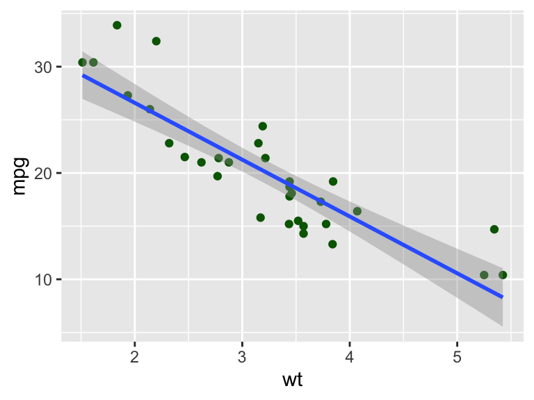
Figure 3.1 gives the resulting plot. There are many ways in which we can extend the plot. For example, we can color the points by another data property. In the following example, we color by the number of cylinders (cyl).
- 1
-
The new aesthetic mapping is added as an argument the
aesfunction. The variablecyl, the number of cylinders, is mapped to thecoloraesthetic.1 - 2
-
Without any change to this command, the scatterplot now uses different colors based on the
cylvalue of the datapoint. - 3
-
The color aesthetic also influences the linear regression fit. The data are grouped by
cyland individual regression lines are determined and drawn for each value. The same colors are used as for the data points.
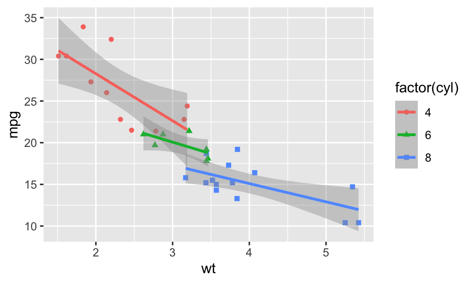
From just looking at the graph in Figure 3.2 alone, it is not clear what the different colors represent. Best practice is to add a legend; ggplot2 does this automatically for you. With the new aesthetic, a legend is added to the plot that explains what the colors represent. This is done automatically to ensure that the resulting visualization follows best practices.
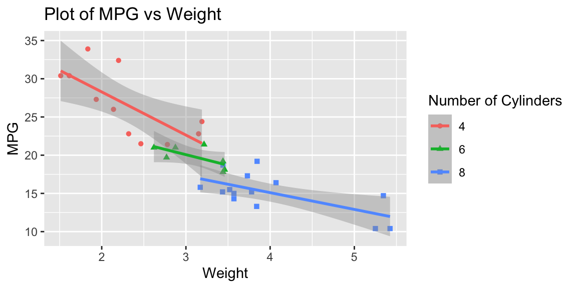
The graph in Figure 3.2 uses the column names wt and mpg as labels for the axis and factor(cyl) for the color information in the legend. We can provide better labels these using the labs command getting the final plot in Figure 3.3.
- 1
-
You can add a
titleto graph using thelabscommand. - 2
-
The values of the
xandyarguments are used to label the axis. - 3
-
The
colorvalue is used in the legend.
This short example should demonstrate the power and flexibility of ggplot2. It is useful to get an understanding of the full potential of ggplot2.
TipTodo
- Go to the ggplot2 website at https://ggplot2.tidyverse.org/ and look at the Reference section.
- Visit the R graph gallery at https://r-graph-gallery.com/ggplot2-package.html to get an overview of the different types of plots that can be created with
ggplot2.
In the following we will look at more examples of graphs that are useful for exploratory data analysis.
3.2 Visualizing a single variable
In exploratory data analysis, we are often interested in the distribution of single variables in a dataset. Commonly used graphs are boxplots, histograms, and density plots.
library(patchwork)
g1 <- ggplot(data = mtcars, mapping = aes(y = mpg)) +
  geom_boxplot() +
  labs(y = "MPG", title = "Boxplot")
g2 <- ggplot(data = mtcars, mapping = aes(x = mpg)) +
  geom_histogram(bins = 20) +
  labs(x = "MPG", title = "Histogram")
g3 <- ggplot(data = mtcars, mapping = aes(x = mpg)) +
  geom_density() +
  labs(x = "MPG", title = "Density plot")

g1 + g2 + g3 + plot_layout(widths = c(1, 2, 2))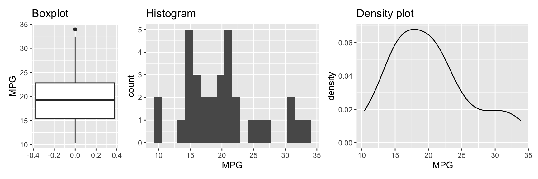
Figure 3.4 shows the three plots. The first plot is a boxplot (geom_boxplot). It shows the median, the first and third quartile, and the minimum and maximum values. The variable of interest is mapped onto the y axis. This is different from the histogram and densityplot where the variable is mapped onto the x axis.2
The second plot is a histogram (geom_histogram). It shows the distribution of the data. By default, the graph uses 30 bins, which may be fine for your data. However, it is often useful to experiment with different bin sizes (binwidth) or counts (bins) and see how the graph changes. It can be helpful to also change the position of the bins using center or boundary. Figure 3.5 shows how these arguments change the creation of bins.
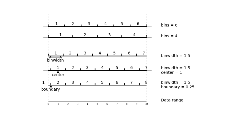
bin, binwidth and boundary in geom_histogram
The third plot in Figure 3.4 is a density plot. It is similar to a histogram but uses a smooth curve instead of bars. Similar to histograms, the shape of density plots can be controlled using arguments. The bw argument controls the smoothness of the density plot. By default, a bandwidth is chosen automatically from the data using one of several approaches. nrd0 (Silverman 1986) or nrd (Scott 1992) are good choices. The adjust argument (default 1) can be used to adjust this automatically determined bandwidth.
Figure 3.6 shows how the histogram and density plot from Figure 3.4 changes when varying binwidth, center, boundary, and bw.
Show the code
library(patchwork)
g <- ggplot(data = mtcars, mapping = aes(x = mpg)) +
  labs(x = "MPG")
g1 <- g + geom_histogram(binwidth = 3) +
  labs(title = "binwidth = 3")
g2 <- g +
  geom_histogram(binwidth = 3, center = 10) +
  labs(title = "binwidth = 3, center = 10")
g3 <- g +
  geom_histogram(binwidth = 3, boundary = 10) +
  labs(title = "binwidth = 3, boundary = 10")

g <- ggplot(data = mtcars, mapping = aes(x = mpg)) +
  labs(x = "MPG")
g4 <- g + geom_density() + labs(title = "bw = \"nrd0\"")
g5 <- g + geom_density(bw = 1.5) + labs(title = "bw = 1.5")
g6 <- g + geom_density(bw = 0.5) + labs(title = "bw = 0.5")
(g1 + g2 + g3) / (g4 + g5 + g6)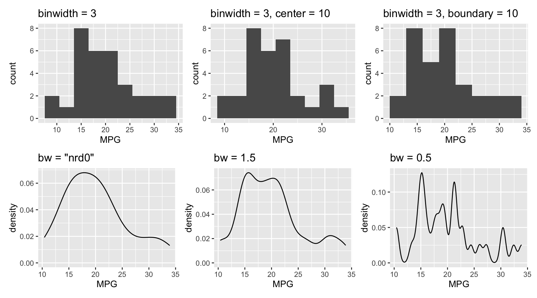
binwidth, center, boundary, and bw on histogram and density plots
TipUseful to know
In Figure 3.4, we combined multiple plots into a single figure using the patchwork package. We create three plots g1, g2, and g3 and then combine them using the + operator. The plot_layout function is used to control the relative sizes here. You will find more examples of this throughout the book.
In Figure 3.6, six plots were combined using
(g1 + g2 + g3) / (g4 + g5 + g6)Sometimes you will be interested in separating the data by a factor. For example, you may want to compare the distribution of the mpg variable for different numbers of cylinders. Figure 3.7 shows the same three plots as before but now grouped by the number of cylinders.
mtcars <- datasets::mtcars %>% mutate(cyl = as.factor(cyl))
g1 <- ggplot(data = mtcars, mapping = aes(y = mpg, x = cyl,
    color = cyl)) +
  geom_boxplot() +
  labs(x = "Cylinders", y = "MPG", title = "Boxplot") +
  theme(legend.position = "none")
g2 <- ggplot(data = mtcars, mapping = aes(x = mpg, fill = cyl)) +
  geom_histogram(bins = 20) +
  labs(x = "MPG", title = "Stacked histogram") +
  theme(legend.position = "none")
g3 <- ggplot(data = mtcars, mapping = aes(x = mpg, fill = cyl)) +
  geom_histogram(bins = 20, alpha = 0.5, position = "identity") +
  labs(x = "MPG", title = "Histogram") +
  theme(legend.position = "none")
g4 <- ggplot(data = mtcars, mapping = aes(x = mpg, fill = cyl)) +
  geom_density(alpha = 0.5) +
  labs(x = "MPG", title = "Density plot") +
  theme(legend.position = "none")

g1 + g2 + g3 + g4 + plot_layout(widths = c(1, 1, 1, 1))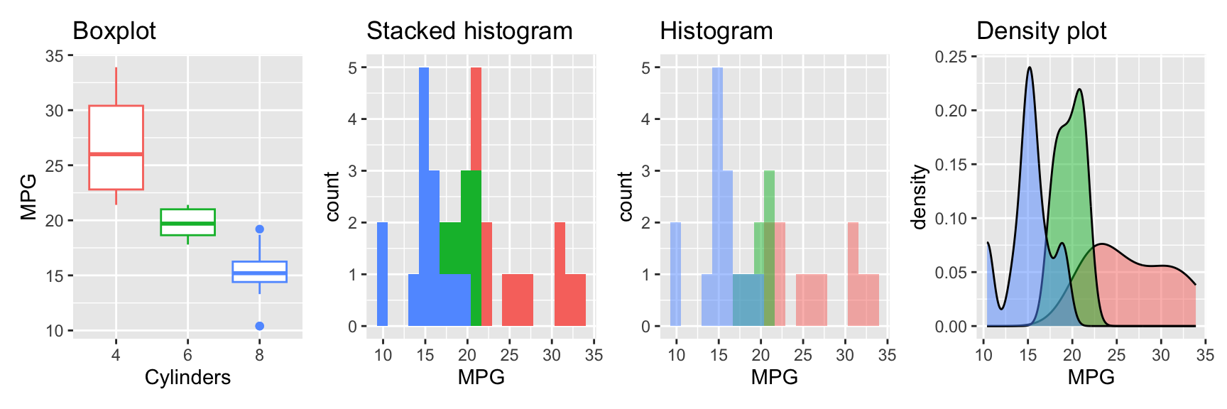
Boxplot: We map the cyl factor both to the y and the color aesthetic. This creates a separate boxplot for each level of the factor.
Stacked histogram: For the histogram, we map the factor to the fill aesthetic. This creates a stacked histogram.
Histogram: To create a histogram for each level of the factor, we need to set the position argument to "identity". This creates a separate histogram for each level of the factor. To avoid the histograms being plotted on top of each other, we set the alpha argument to 0.5. This makes the histograms transparent.
Densityplot: The densityplot is similar to the histogram. We map the factor to the fill aesthetic and set the alpha argument to 0.5 to create overlayed densityplots for each level of the factor. The position argument has the same effect as for geom_histogram. The difference is that default are overlayed densityplots. Using position="stack" creates stacked densityplots.
By changing the x and y mapping, the boxplot can be arranged horizontally. See Figure 3.8.
g <- ggplot(data = mtcars, mapping = aes(x = mpg, y = cyl,
    color = cyl)) +
  geom_boxplot() +
  labs(x = "MPG", y = "Cylinders", title = "Boxplot") +
  theme(legend.position = "none")
g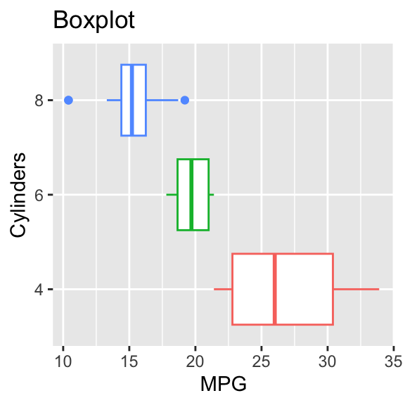
3.3 Visualizing two variables
The introductory example showed the relationship between two variables using a scatterplot. Scatterplots are a good choice if the number of data points isn’t too large. If the number of points gets larger, data points will be shown on top of each other. In this case, using transparent points, will reveal the density of the data. The argument alpha changes the transparency. alpha=1 is the default no transparency. Reducing it increases the transparency; 0 makes the point invisible. A good starting point is 0.5. Always try a variety of alpha values to see which one works best for your data. See Figure 3.9 that demonstrates the effect of adding transparency.
auto <- ISLR2::Auto %>%
  mutate(cylinders = as.factor(cylinders))

g1_1 <- ggplot(data = auto, mapping = aes(x = weight, y = mpg)) +
  geom_point() +
  labs(title = "Scatterplot", x = "Weight", y = "MPG")
g1_2 <- ggplot(data = auto, mapping = aes(x = weight, y = mpg)) +
  geom_point(alpha = 0.5) +
  labs(title = "Scatterplot with transparency",
    x = "Weight", y = "MPG")

g1_1 + g1_2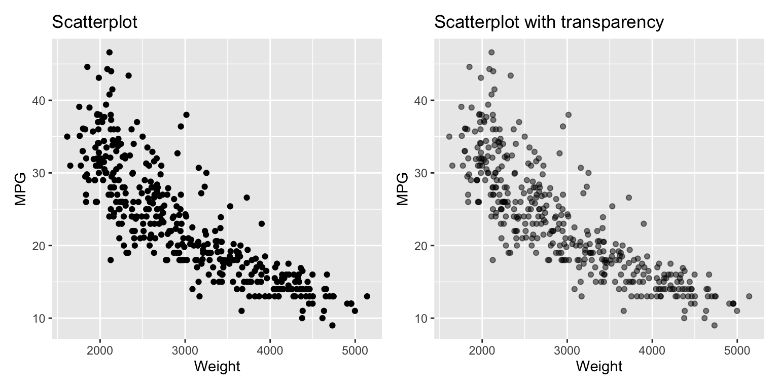
For very large datasets, it is better to use a heatmap or a two-dimensional density plot. Figure 3.10 shows the two versions of the heatmap for the ISLR2::Auto dataset.
g1 <- ggplot(data = auto, mapping = aes(x = weight, y = mpg)) +
  geom_bin_2d(bins = 15) +
  labs(x = "Weight", y = "MPG", title = "Rectangular heatmap")
g2 <- ggplot(data = auto, mapping = aes(x = weight, y = mpg)) +
  geom_hex(bins = 15) +
  scale_fill_viridis_c(direction = -1) +
  labs(x = "Weight", y = "MPG", title = "Hexagonal heatmap")

g1 + g2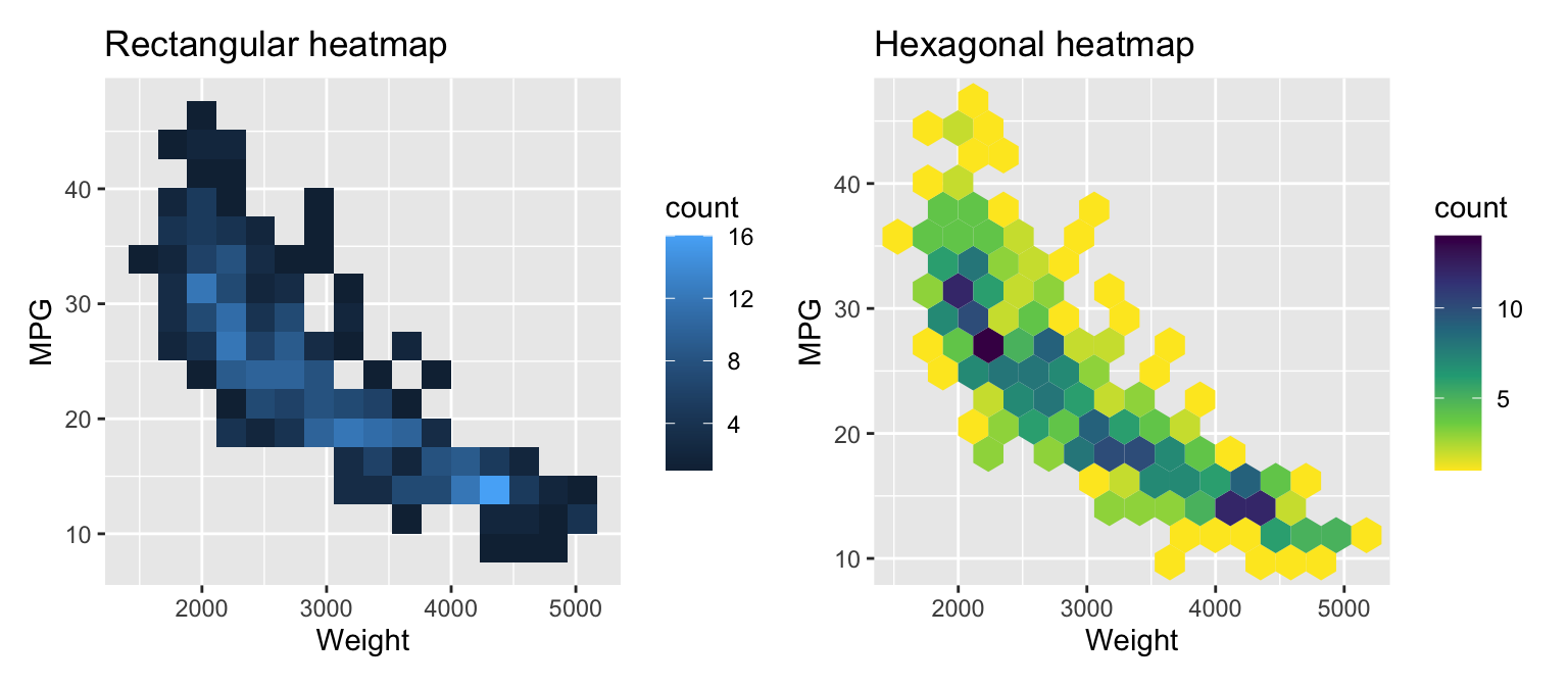
The functions geom_bin_2d and geom_hex create heatmap representations of the distribution. The first uses rectangular, the second hexagonal patches. Use the bins argument to change the number of bins in a direction.Similar to histograms, try different values for bins for your data. There are other arguments to control binning. In the second example, we use a different colormap. Check the documentation for details.
By default, the color represents the count of data points in a bin. If you want to use a value, e.g. the average of a variable, you can use the stat_summary_2d function. See Figure 3.11 for an example.
ggplot(data = auto, mapping = aes(x = weight, y = displacement)) +
  stat_summary_hex(aes(z = mpg), bins = 10, fun = mean) +
  scale_fill_viridis_c(direction = -1) +
  geom_point() +
  labs(title = "Color heatmap by average of `mpg`",
    x = "Weight", y = "Displacement")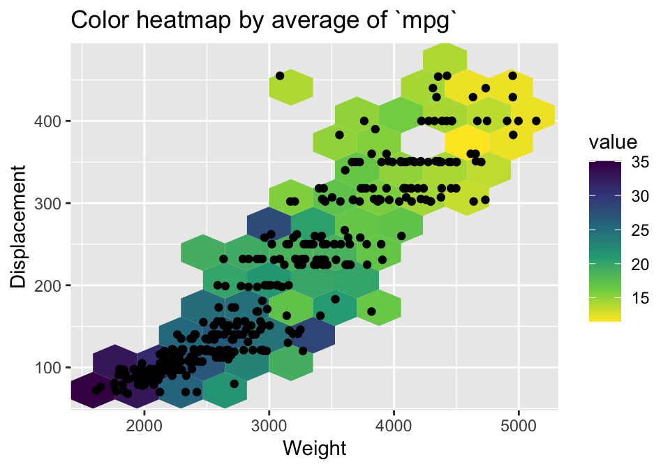
mpg
Examples for two dimensional density plots are shown in Figure 3.12. The geom_density_2d function adds the density plot layer.
g1 <- ggplot(data = auto, mapping = aes(x = weight, y = mpg)) +
  geom_density_2d() +
  geom_point(size = 0.5, color = "darkblue") +
  labs(x = "Weight", y = "MPG", title = "Two-dimensional density")
g2 <- ggplot(data = auto, mapping = aes(x = weight, y = mpg,
    color = cylinders, shape = cylinders)) +
  geom_point(size = 0.5) +
  geom_density_2d() +
  scale_colour_brewer(palette = "Set1") +
  labs(title = "Two-dimensional density by categorical variable",
    x = "Weight", y = "MPG", color = "Number of Cylinders",
    shape = "Number of Cylinders")
g1 + g2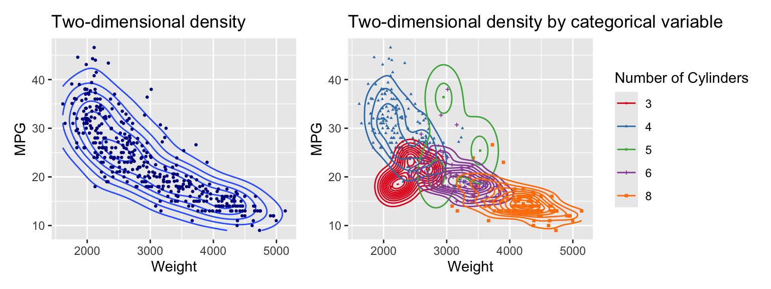
The left graph shows the density using contour lines. The right graph overlays individual density contours for each of the subsets formed by the categorical variable cylinders. The scale_colour_brewer function selects the colors. The palette argument specifies the color palette. Set1 is a good choice for categorical variables.
TipUseful to know
The “Brewer” color scales are based on the work of Cynthia Brewer who designed color palettes for different use cases. While it was initially developed for coloring maps, the various palettes have become popular options for coloring graphs. You can go to https://colorbrewer2.org/ to explore this more.
We can add filled contour lines using the function geom_density_2d_filled. See Figure 3.13.
g1 <- ggplot(data = auto, mapping = aes(x = weight, y = mpg)) +
  geom_density_2d_filled(alpha = 0.5) +
  geom_point(size = 0.5) +
  labs(title = "Two-dimensional density (filled)",
    x = "Weight", y = "MPG") +
  theme(legend.position = "none")
g2 <- ggplot(data = auto, mapping = aes(x = weight, y = mpg)) +
  geom_density_2d_filled() + #contour_var = "ndensity", bins = 5) +
  geom_point(size = 0.5) +
  scale_fill_brewer() +
  labs(title = "Alternative color scheme",
    x = "Weight", y = "MPG") +
  theme(legend.position = "none")

g1 + g2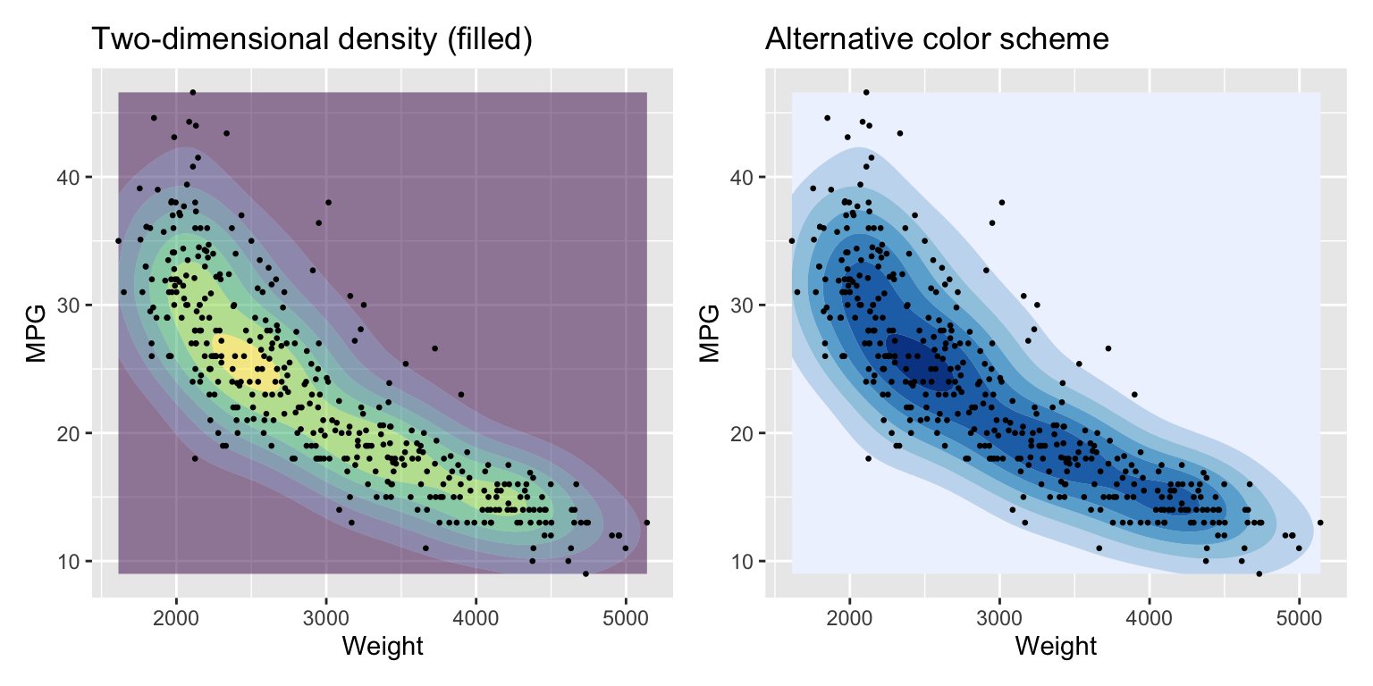
3.4 Visualizing multiple variables
One option to visualize multiple variables in a graph is a pairplot. Figure 3.14 uses the ggpairs function from the GGally package.
pair_auto <- ISLR2::Auto %>%
  mutate(
    cylinders = as.factor(cylinders),
    origin = as.factor(origin),
  ) %>%
  select(-name)
ggpairs(pair_auto,
  lower = list(combo = wrap("facethist", binwidth = 0.5)))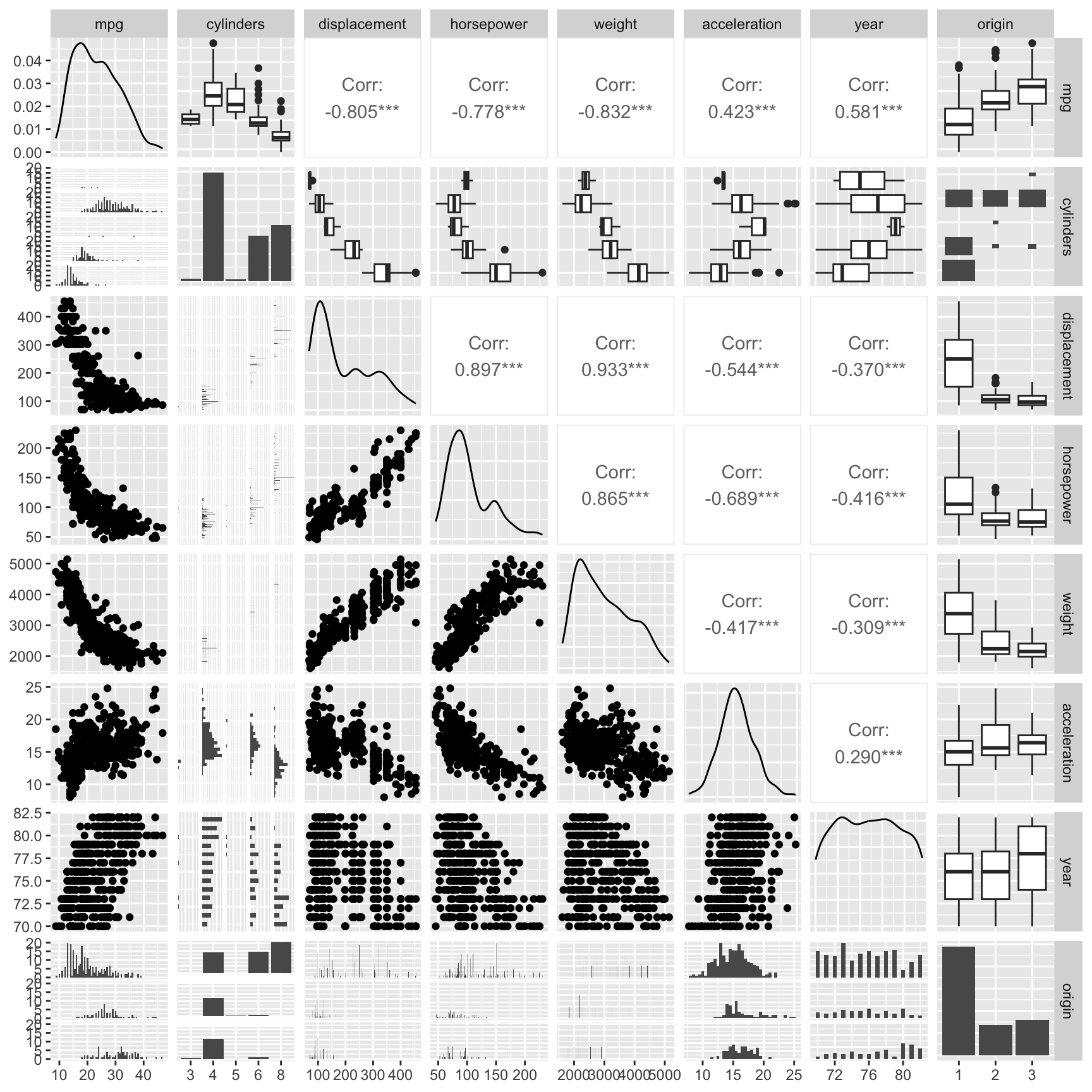
A pairplot shows visualizations of pairs of variables in a compact presentation. By default, ggpairs uses densityplots and bar charts along the diagonal to show the distribution of continuous and categorical variables. The upper and lower triangle visualizations depend on the type of the two variables. If both variables are are continuous, the upper triangle shows their correlation as a value and the lower triangle a scatterplot. If one variable is continuous and the other is categorical, the upper triangle uses boxplots and the lower triangle a bar chart. If both variables are categorical, the lower triangle shows a bar chart and the upper triangle a type of two dimensional bar chart.
Figure 3.15 shows an alternative visualization of multiple variables. The ggparcoord function from the GGally package creates a parallel coordinate plot. It shows the values of each data point as a line.
g1 <- pair_auto %>%
  ggparcoord(columns = 1:7, groupColumn = 8)
g2 <- pair_auto %>%
  ggparcoord(columns = c(2:5, 7, 6, 1), groupColumn = 8, alpha = 0.5,
    splineFactor = 10)
g1 + g2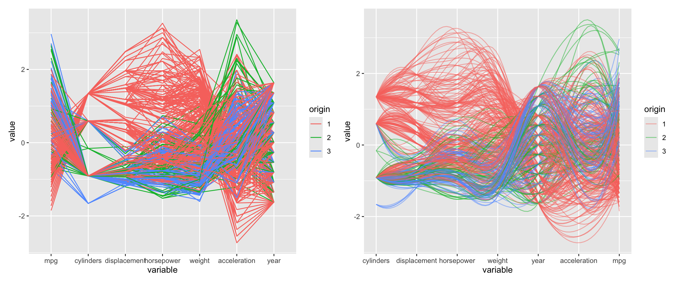
Parallel coordinate plots can be hard to read and it is worth exerimenting with different orderings of the variables and other settings. Here, we used alpha to make the lines transparent which helps for larger datasets. The splineFactor argument controls the smoothness of the lines. Without smoothing, the variable values would be connected by straight lines. This separates the lines and makes it easier to see the distribution of the data. It also adds information on how the coordinates to the left (mpg) and the right (displacement) are connected. The groupColumn argument is used to color the lines by the origin of the car.
Parallel coordinate plots also benefit greatly from interactivity. You can use the plotly package to create interactive parallel coordinate plots (see https://plotly.com/r/parallel-coordinates-plot/ for examples).
3.5 Saving plots to file
You can save plots to file using the ggsave function. The following example saves the scatterplot from Figure 3.13 to a png file.
ggsave(filename = "example.png", plot = g1 + g2,
  width = 12.6, height = 6.3, units = "in", dpi = 300)
Here is the saved figure:
knitr::include_graphics("example.png")
3.6 autoplot and autolayer functions
Some R packages provide autoplot functions that create ggplot2 graphs. If available, these functions are useful for quickly visualizing special data or the result of calculations. The functions return a ggplot2 graph that can be further customized using the methods shown in this chapter. Packages that implement the autoplot function often also provide an autolayer function. This function adds a layer with a specialized visualization to an existing ggplot2 graph.
In this book, we use autoplot functions to visualize the results of model tuning (see Chapter 14) and ROC curves (see Section 10.3).
For example, the forecast package provides autoplot and autolayer functions for time series objects. Figure 3.17 shows how the autoplot function selects an appropriate axis scale for time series data.
library(forecast)Registered S3 method overwritten by 'quantmod':
method from
as.zoo.data.frame zoo autoplot(AirPassengers) +
autolayer(seasadj(decompose(AirPassengers, "multiplicative"))) +
theme(legend.position = "none")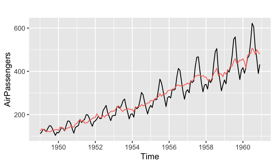
NoteFurther information
- The ggplot2 cheatsheet is a two-page summary of all the main features of ggplot2.
- For more details about ggplot2, see the main ggplot2 website at https://ggplot2.tidyverse.org/.
- The R graph gallery provides an overview of the different types of plots that can be created with ggplot2.
- ggplot2: Elegant Graphics for Data Analysis by Hadley Wickham et al. is the definitive guide to ggplot2.
- The R Graphics Cookbook by Winston Chang is a great resource for learning how to create different types of plots in R.
- https://ggobi.github.io/ggally/ is the website of the
GGallypackage. It provides a number of useful functions for creating more complex plots withggplot2.
Code
The code of this chapter is summarized here.
Show the code
knitr::opts_chunk$set(echo = TRUE, cache = TRUE, autodep = TRUE,
fig.align = "center")
library(tidyverse)
library(patchwork)
library(GGally)
library(hexbin)
ggplot(data = mtcars, mapping = aes(x = wt, y = mpg)) +
geom_point(color = "darkgreen") +
geom_smooth(formula = y ~ x, method = "lm")
ggplot(data = mtcars, mapping = aes(x = wt, y = mpg,
color = factor(cyl), shape = factor(cyl))) +
geom_point() +
geom_smooth(formula = y ~ x, method = "lm")
ggplot(data = mtcars, mapping = aes(x = wt, y = mpg,
color = factor(cyl), shape = factor(cyl))) +
geom_point() +
geom_smooth(formula = y ~ x, method = "lm") +
labs(title = "Plot of MPG vs Weight",
x = "Weight",
y = "MPG",
color = "Number of Cylinders",
shape = "Number of Cylinders")
library(patchwork)
g1 <- ggplot(data = mtcars, mapping = aes(y = mpg)) +
geom_boxplot() +
labs(y = "MPG", title = "Boxplot")
g2 <- ggplot(data = mtcars, mapping = aes(x = mpg)) +
geom_histogram(bins = 20) +
labs(x = "MPG", title = "Histogram")
g3 <- ggplot(data = mtcars, mapping = aes(x = mpg)) +
geom_density() +
labs(x = "MPG", title = "Density plot")
g1 + g2 + g3 + plot_layout(widths = c(1, 2, 2))
knitr::include_graphics("images/bin_binwidth.png")
library(patchwork)
g <- ggplot(data = mtcars, mapping = aes(x = mpg)) +
labs(x = "MPG")
g1 <- g + geom_histogram(binwidth = 3) +
labs(title = "binwidth = 3")
g2 <- g +
geom_histogram(binwidth = 3, center = 10) +
labs(title = "binwidth = 3, center = 10")
g3 <- g +
geom_histogram(binwidth = 3, boundary = 10) +
labs(title = "binwidth = 3, boundary = 10")
g <- ggplot(data = mtcars, mapping = aes(x = mpg)) +
labs(x = "MPG")
g4 <- g + geom_density() + labs(title = "bw = \"nrd0\"")
g5 <- g + geom_density(bw = 1.5) + labs(title = "bw = 1.5")
g6 <- g + geom_density(bw = 0.5) + labs(title = "bw = 0.5")
(g1 + g2 + g3) / (g4 + g5 + g6)
(g1 + g2 + g3) / (g4 + g5 + g6)
mtcars <- datasets::mtcars %>% mutate(cyl = as.factor(cyl))
g1 <- ggplot(data = mtcars, mapping = aes(y = mpg, x = cyl,
color = cyl)) +
geom_boxplot() +
labs(x = "Cylinders", y = "MPG", title = "Boxplot") +
theme(legend.position = "none")
g2 <- ggplot(data = mtcars, mapping = aes(x = mpg, fill = cyl)) +
geom_histogram(bins = 20) +
labs(x = "MPG", title = "Stacked histogram") +
theme(legend.position = "none")
g3 <- ggplot(data = mtcars, mapping = aes(x = mpg, fill = cyl)) +
geom_histogram(bins = 20, alpha = 0.5, position = "identity") +
labs(x = "MPG", title = "Histogram") +
theme(legend.position = "none")
g4 <- ggplot(data = mtcars, mapping = aes(x = mpg, fill = cyl)) +
geom_density(alpha = 0.5) +
labs(x = "MPG", title = "Density plot") +
theme(legend.position = "none")
g1 + g2 + g3 + g4 + plot_layout(widths = c(1, 1, 1, 1))
g <- ggplot(data = mtcars, mapping = aes(x = mpg, y = cyl,
color = cyl)) +
geom_boxplot() +
labs(x = "MPG", y = "Cylinders", title = "Boxplot") +
theme(legend.position = "none")
g
auto <- ISLR2::Auto %>%
mutate(cylinders = as.factor(cylinders))
g1_1 <- ggplot(data = auto, mapping = aes(x = weight, y = mpg)) +
geom_point() +
labs(title = "Scatterplot", x = "Weight", y = "MPG")
g1_2 <- ggplot(data = auto, mapping = aes(x = weight, y = mpg)) +
geom_point(alpha = 0.5) +
labs(title = "Scatterplot with transparency",
x = "Weight", y = "MPG")
g1_1 + g1_2
g1 <- ggplot(data = auto, mapping = aes(x = weight, y = mpg)) +
geom_bin_2d(bins = 15) +
labs(x = "Weight", y = "MPG", title = "Rectangular heatmap")
g2 <- ggplot(data = auto, mapping = aes(x = weight, y = mpg)) +
geom_hex(bins = 15) +
scale_fill_viridis_c(direction = -1) +
labs(x = "Weight", y = "MPG", title = "Hexagonal heatmap")
g1 + g2
ggplot(data = auto, mapping = aes(x = weight, y = displacement)) +
stat_summary_hex(aes(z = mpg), bins = 10, fun = mean) +
scale_fill_viridis_c(direction = -1) +
geom_point() +
labs(title = "Color heatmap by average of `mpg`",
x = "Weight", y = "Displacement")
g1 <- ggplot(data = auto, mapping = aes(x = weight, y = mpg)) +
geom_density_2d() +
geom_point(size = 0.5, color = "darkblue") +
labs(x = "Weight", y = "MPG", title = "Two-dimensional density")
g2 <- ggplot(data = auto, mapping = aes(x = weight, y = mpg,
color = cylinders, shape = cylinders)) +
geom_point(size = 0.5) +
geom_density_2d() +
scale_colour_brewer(palette = "Set1") +
labs(title = "Two-dimensional density by categorical variable",
x = "Weight", y = "MPG", color = "Number of Cylinders",
shape = "Number of Cylinders")
g1 + g2
g1 <- ggplot(data = auto, mapping = aes(x = weight, y = mpg)) +
geom_density_2d_filled(alpha = 0.5) +
geom_point(size = 0.5) +
labs(title = "Two-dimensional density (filled)",
x = "Weight", y = "MPG") +
theme(legend.position = "none")
g2 <- ggplot(data = auto, mapping = aes(x = weight, y = mpg)) +
geom_density_2d_filled() + #contour_var = "ndensity", bins = 5) +
geom_point(size = 0.5) +
scale_fill_brewer() +
labs(title = "Alternative color scheme",
x = "Weight", y = "MPG") +
theme(legend.position = "none")
g1 + g2
pair_auto <- ISLR2::Auto %>%
mutate(
cylinders = as.factor(cylinders),
origin = as.factor(origin),
) %>%
select(-name)
ggpairs(pair_auto,
lower = list(combo = wrap("facethist", binwidth = 0.5)))
g1 <- pair_auto %>%
ggparcoord(columns = 1:7, groupColumn = 8)
g2 <- pair_auto %>%
ggparcoord(columns = c(2:5, 7, 6, 1), groupColumn = 8, alpha = 0.5,
splineFactor = 10)
g1 + g2
ggsave(filename = "example.png", plot = g1 + g2,
width = 12.6, height = 6.3, units = "in", dpi = 300)
knitr::include_graphics("example.png")
library(forecast)
autoplot(AirPassengers) +
  autolayer(seasadj(decompose(AirPassengers, "multiplicative"))) +
  theme(legend.position = "none")