library(ca)
library(cluster)
library(ellipse)
library(ggrepel)
library(mclust)
library(tidyclust)
library(tidymodels)
library(tidyverse)

set.seed(123)

# Location of the data files. Adjust this path if you keep the data
# files in a different directory.
DATA_DIR <- '../data'Chapter 7: Unsupervised Learning
Unsupervised Learning
Principal Components Analysis
A Simple Example
sp500_px <- read_csv(file.path(DATA_DIR, "sp500_data.csv.gz"), show_col_types = FALSE)

oil_px <- sp500_px[, c("CVX", "XOM")]
pca <- princomp(oil_px)
pca$loadings
Loadings:
    Comp.1 Comp.2
CVX  0.747  0.665
XOM  0.665 -0.747

               Comp.1 Comp.2
SS loadings       1.0    1.0
Proportion Var    0.5    0.5
Cumulative Var    0.5    1.0
pca_rec <- recipe(data = sp500_px, formula = ~ CVX + XOM) %>%
step_pca(all_numeric_predictors())
pca_prep <- pca_rec %>%
prep()
pca_prep$steps[[1]]$rotationNULLloadings <- pca$loadings
ggplot(data = oil_px, aes(x = CVX, y = XOM)) +
geom_point(alpha = 0.3) +
stat_ellipse(type = "norm", level = 0.99) +
geom_abline(intercept = 0, slope = loadings[2, 1] / loadings[1, 1]) +
geom_abline(intercept = 0, slope = loadings[2, 2] / loadings[1, 2]) +
coord_cartesian(xlim = c(-3, 3), ylim = c(-3, 3))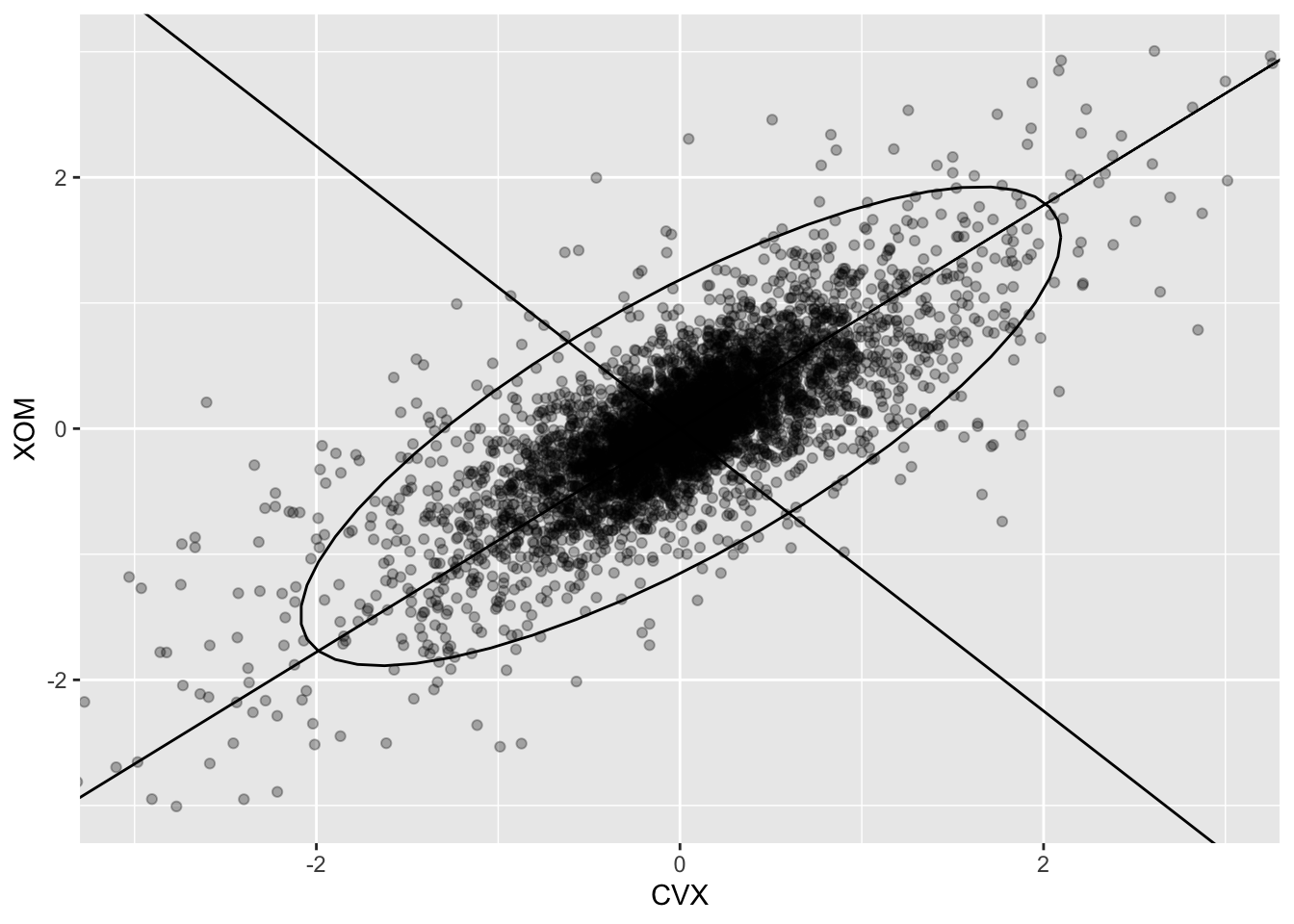
Interpreting Principal Components
syms <- c("AAPL", "MSFT", "CSCO", "INTC", "CVX", "XOM", "SLB",
  "COP", "JPM", "WFC", "USB", "AXP", "WMT", "TGT", "HD", "COST")
top_sp <- sp500_px %>%
  filter(Date >= "2011-01-01") %>%
  select(all_of(syms))
sp_pca <- princomp(top_sp)
screeplot(sp_pca)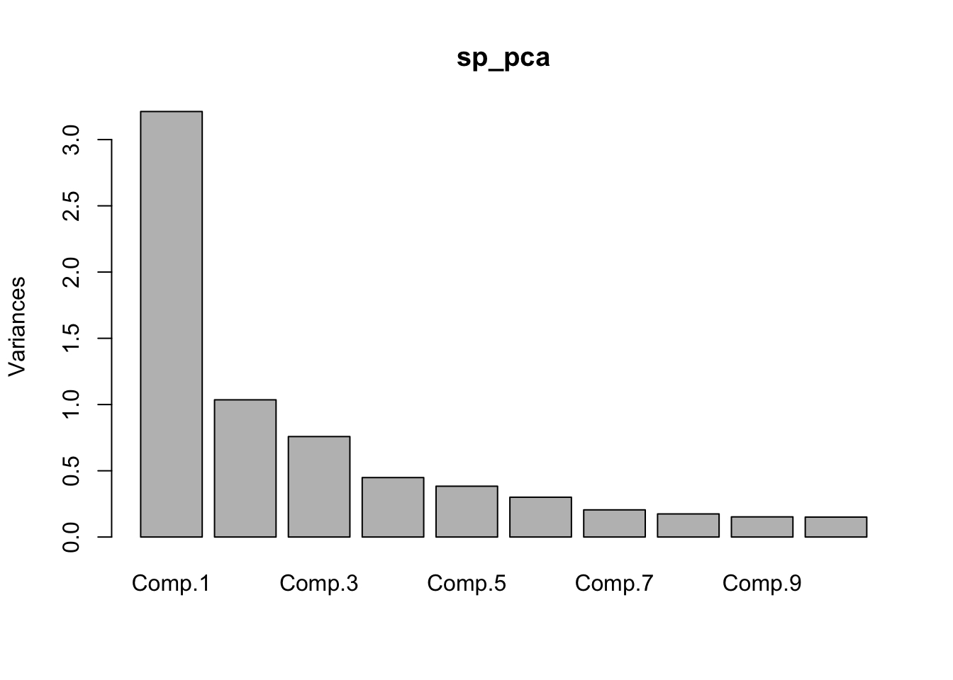
components <- 1:length(sp_pca$sdev)
g <- tibble(
  Components = components,
  Variances = sp_pca$sdev ** 2,
) |>
filter(
  Components < 11,
) |>
  ggplot(aes(x=Components, y=Variances)) +
    geom_bar(stat="identity") +
    coord_cartesian(xlim = c(0.5, 10.49)) +
    scale_x_continuous(breaks = components) +
    theme_bw()
g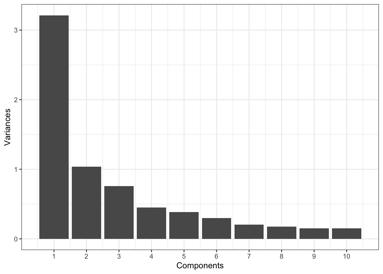
loadings <- sp_pca$loadings[, 1:5]
loadings <- as_tibble(loadings) %>%
  mutate(Symbol = row.names(loadings)) %>%
  pivot_longer(cols = starts_with("Comp"), names_to = "Component",
    values_to = "Weight") %>%
  mutate(color = Weight > 0)
ggplot(loadings, aes(x = Symbol, y = Weight, fill = color)) +
  geom_bar(stat = "identity") +
  facet_grid(Component ~ ., scales = "free_y") +
  guides(fill = "none") +
  labs(y = "Component Loading") +
  theme_bw() +
  theme(axis.title.x = element_blank(),
    axis.text.x = element_text(angle = 90, vjust = 0.5))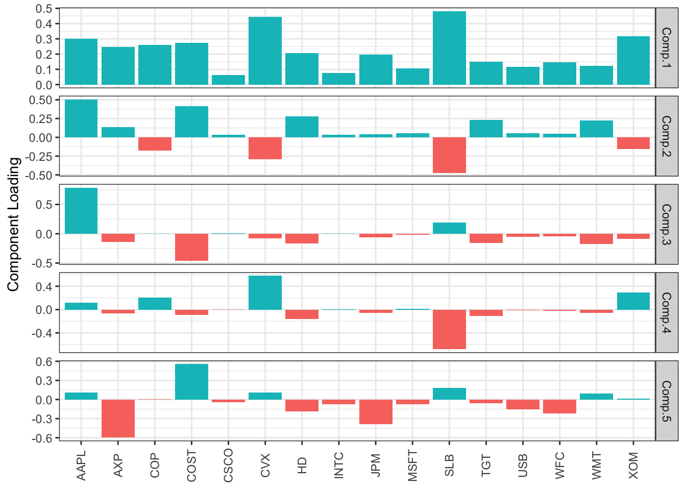
Correspondence Analysis
housetasks <- read_csv(file.path(DATA_DIR, "housetasks.csv"), show_col_types = FALSE) %>%
  column_to_rownames(var = "Task")
ca_analysis <- ca(housetasks)
plot(ca_analysis)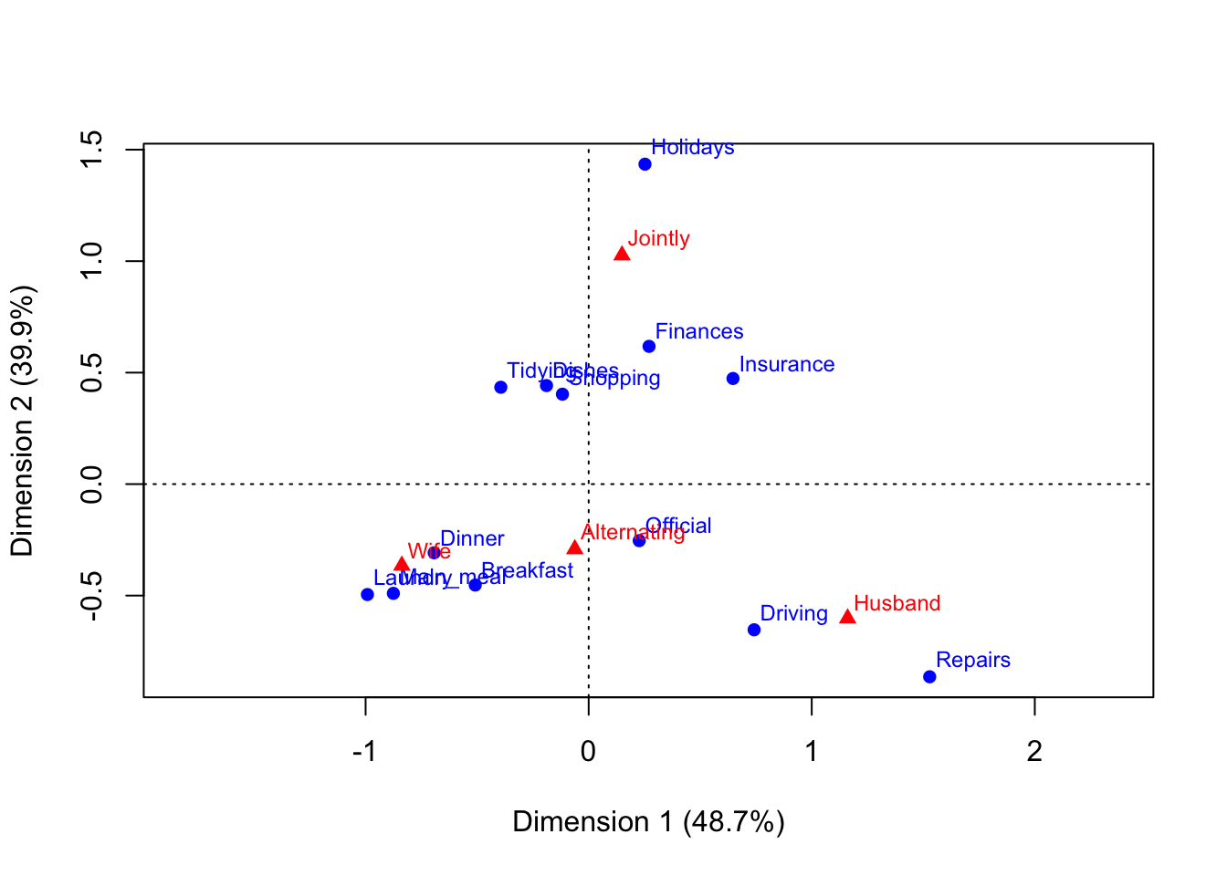
K-Means Clustering
A Simple Example
df <- sp500_px %>%
  filter(Date >= "2011-01-01")
kmeans_wf <- workflow() %>%
  add_recipe(recipe(~ XOM + CVX, data = df)) %>%
  add_model(k_means(num_clusters = 4))
model <- kmeans_wf %>% fit(df)augment(model, df) %>%
select(Date, XOM, CVX, .pred_cluster) %>%
head()# A tibble: 6 × 4
Date XOM CVX .pred_cluster
<date> <dbl> <dbl> <fct>
1 2011-01-03 0.737 0.241 Cluster_1
2 2011-01-04 0.169 -0.585 Cluster_2
3 2011-01-05 0.0266 0.447 Cluster_1
4 2011-01-06 0.249 -0.920 Cluster_2
5 2011-01-07 0.337 0.181 Cluster_1
6 2011-01-10 0 -0.464 Cluster_2 tidy(model)# A tibble: 4 × 5
XOM CVX size withinss cluster
<dbl> <dbl> <int> <dbl> <fct>
1 0.326 0.450 469 123. 1
2 -0.286 -0.493 421 115. 2
3 1.09 1.58 123 85.2 3
4 -1.12 -1.72 118 87.9 4 ggplot(augment(model, df), aes(x = XOM, y = CVX)) +
geom_point(aes(color = .pred_cluster, shape = .pred_cluster), alpha = 0.3) +
geom_point(data = tidy(model), aes(x = XOM, y = CVX), size = 3, stroke = 2)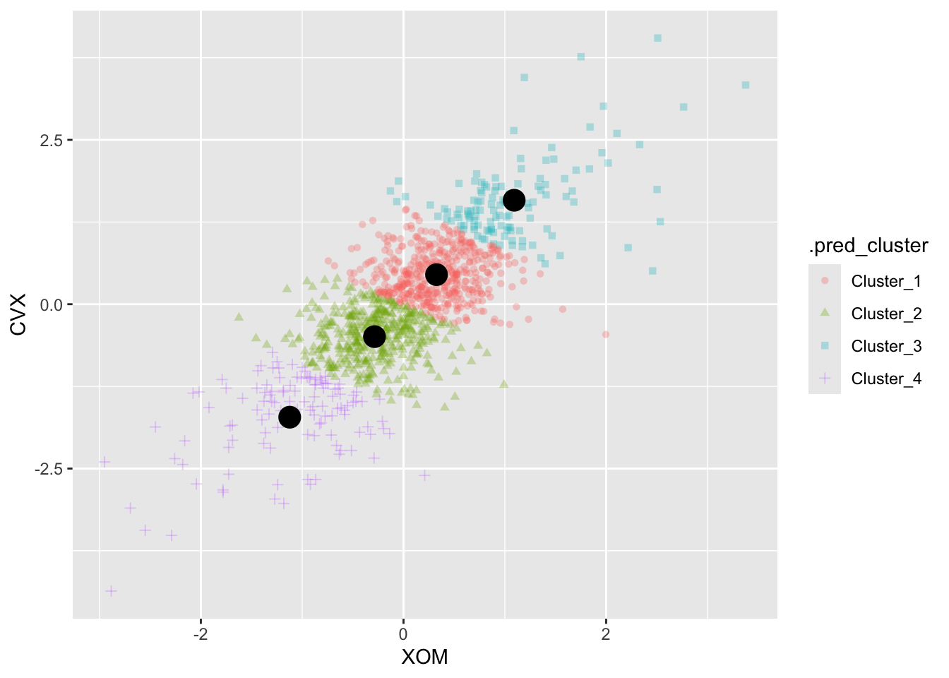
K-Means Algorithm
syms <- c("AAPL", "MSFT", "CSCO", "INTC", "CVX", "XOM", "SLB", "COP",
  "JPM", "WFC", "USB", "AXP", "WMT", "TGT", "HD", "COST")
df <- sp500_px %>%
  filter(Date >= "2011-01-01") %>%
  select(all_of(syms))
set.seed(10010)
kmeans_wf <- workflow() %>%
  add_recipe(recipe(~ ., data = df)) %>%
  add_model(k_means(num_clusters = 5) %>%
      set_engine("stats", nstart = 10))
km <- kmeans_wf %>% fit(df)
Interpreting the Clusters
tidy(km)$size[1] 287 267 293 178 106centers <- tidy(km) %>%
pivot_longer(cols = all_of(syms), names_to = "Symbol",
values_to = "Mean") %>%
mutate(Color = Mean > 0)
ggplot(centers, aes(x = Symbol, y = Mean, fill = Color)) +
geom_bar(stat = "identity", position = "identity", width = 0.75) +
facet_grid(cluster ~ ., scales = "free_y") +
guides(fill = "none") +
labs(y = "Component Loading") +
theme_bw() +
theme(axis.title.x = element_blank(),
axis.text.x = element_text(angle = 90, vjust = 0.5))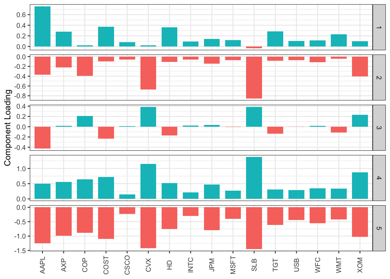
Selecting the Number of Clusters
set.seed(10010)
train_kmeans <- function(num_clusters, data) {
  model <- workflow() %>%
    add_recipe(recipe(~ ., data = data)) %>%
    add_model(k_means(num_clusters = num_clusters) %>%
        set_engine("stats", nstart = 50, iter.max = 100)) %>%
    fit(data)
  return(model)
}
km <- train_kmeans(14, df)
totalss <- extract_fit_engine(km)$totss

pct_var <- tibble(pct_var = 0, num_clusters = 2:14)
for (num_clusters in 2:14) {
  km_cluster <- train_kmeans(num_clusters, df)
  pct_var[num_clusters - 1, "pct_var"] <- (
    extract_fit_engine(km_cluster)$betweenss / totalss)
}
ggplot(pct_var, aes(x = num_clusters, y = pct_var)) +
  geom_line() +
  geom_point() +
  labs(x = "Number of clusters (k)", y = "% Variance Explained")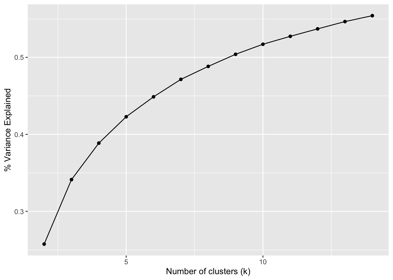
Hierarchical Clustering
A Simple Example
syms1 <- c("GOOGL", "AMZN", "AAPL", "MSFT", "CSCO", "INTC", "CVX", "XOM", "SLB",
  "COP", "JPM", "WFC", "USB", "AXP", "WMT", "TGT", "HD", "COST")
df <- sp500_px %>%
  filter(Date >= "2011-01-01") %>%
  select(all_of(syms1)) %>%
  t() # take transpose: to cluster companies, we need the stocks along the rows

d <- dist(df)
hcl <- hclust(d)
The Dendrogram
plot(hcl)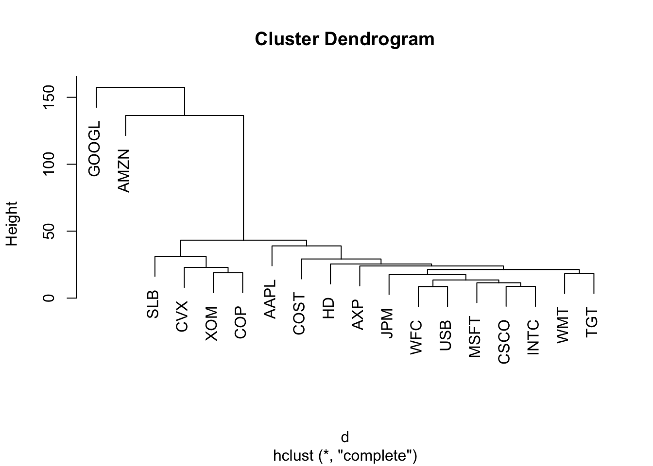
plot(hcl, ylab = "distance", xlab = "", sub = "", main = "")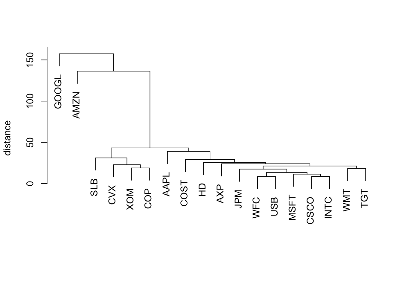
cutree(hcl, k = 4)GOOGL AMZN AAPL MSFT CSCO INTC CVX XOM SLB COP JPM WFC USB
1 2 3 3 3 3 4 4 4 4 3 3 3
AXP WMT TGT HD COST
3 3 3 3 3 Model-Based Clustering
Mixtures of Normals
df <- sp500_px %>%
  filter(Date >= "2011-01-01") %>%
  select(c(XOM, CVX))
mcl <- Mclust(df)
summary(mcl)
----------------------------------------------------
Gaussian finite mixture model fitted by EM algorithm
----------------------------------------------------
Mclust VEE (ellipsoidal, equal shape and orientation) model with 2 components:
log-likelihood n df BIC ICL
-2255.125 1131 9 -4573.528 -5075.657
Clustering table:
1 2
168 963 cluster <- factor(predict(mcl)$classification)
ggplot(df, aes(x = XOM, y = CVX, color = cluster, shape = cluster)) +
geom_point(alpha = 0.8) +
scale_shape_manual(
values = c(1, 3),
guide = guide_legend(override.aes = aes(size = 2)))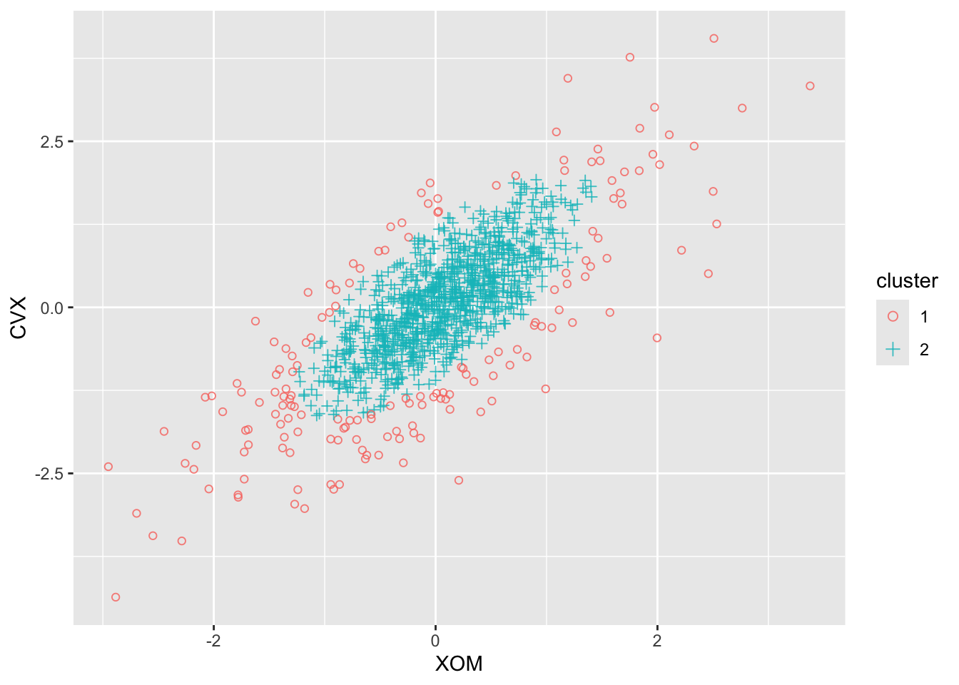
summary(mcl, parameters = TRUE)$mean [,1] [,2]
XOM -0.04362218 0.05792282
CVX -0.21109525 0.07375447summary(mcl, parameters = TRUE)$variance, , 1
XOM CVX
XOM 1.044671 1.065190
CVX 1.065190 1.912748
, , 2
XOM CVX
XOM 0.2998935 0.3057838
CVX 0.3057838 0.5490920Selecting the Number of Clusters
plot(mcl, what = "BIC", ask = FALSE)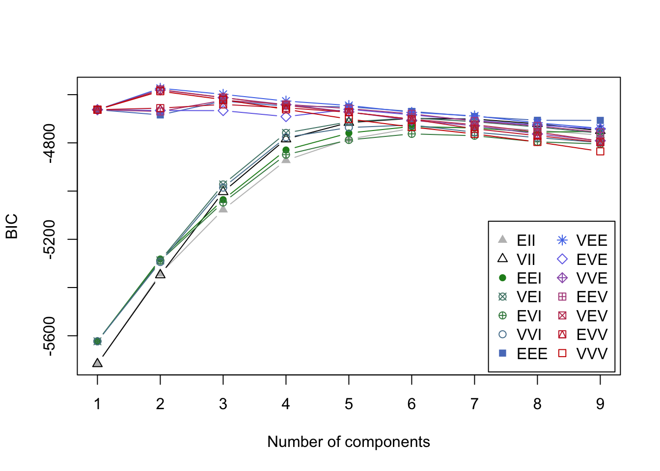
plot(mcl, what = "BIC", ask = FALSE)
Scaling and Categorical Variables
Scaling the Variables
loan_data <- read_csv(file.path(DATA_DIR, "loan_data.csv.gz"), show_col_types = FALSE) %>%
  mutate(
    across(where(is.character), as.factor),
    outcome = factor(outcome, levels = c("paid off", "default"))
  )
defaults <- loan_data %>%
  filter(outcome == "default") %>%
  select(c(loan_amnt, annual_inc, revol_bal, open_acc, dti, revol_util))
km <- kmeans(defaults, centers = 4, nstart = 10)
centers <- data.frame(size = km$size, km$centers)
round(centers, digits = 2)
size loan_amnt annual_inc revol_bal open_acc dti revol_util
1 13819 10577.04 42380.98 10245.27 9.58 17.71 58.09
2 1221 21797.26 164503.32 38652.54 12.61 13.53 63.65
3 7579 18247.71 83069.61 19587.30 11.66 16.79 62.26
4 52 22570.19 489783.40 85161.35 13.33 6.91 59.65df0 <- scale(df)
km0 <- kmeans(df0, centers = 4, nstart = 10)
centers0 <- scale(km0$centers, center = FALSE,
scale = 1 / attr(df0, "scaled:scale"))
centers0 <- scale(centers0, center = -attr(df0, "scaled:center"),
scale = FALSE)
centers0 <- data.frame(size = km0$size, centers0)
round(centers0, digits = 2) size XOM CVX
1 131 1.17 1.45
2 420 -0.29 -0.44
3 450 0.33 0.45
4 130 -1.13 -1.62Dominant Variables
syms <- c("GOOGL", "AMZN", "AAPL", "MSFT", "CSCO", "INTC", "CVX", "XOM", "SLB",
  "COP", "JPM", "WFC", "USB", "AXP", "WMT", "TGT", "HD", "COST")
top_sp1 <- sp500_px %>%
  filter(Date >= "2011-01-01") %>%
  select(all_of(syms))
sp_pca1 <- princomp(top_sp1)
screeplot(sp_pca1)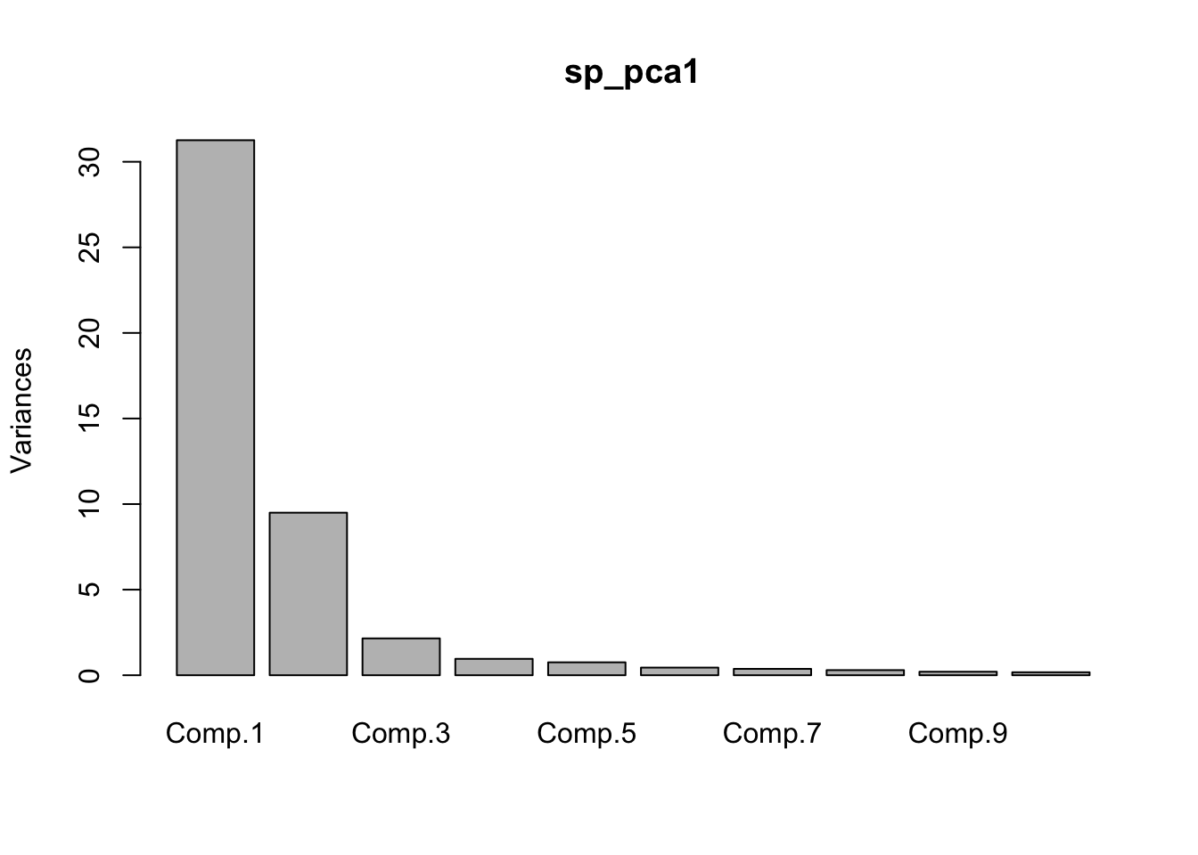
components <- 1:length(sp_pca1$sdev)
g <- tibble(
  Components = components,
  Variances = sp_pca1$sdev ** 2,
) |>
filter(
  Components < 11,
) |>
  ggplot(aes(x=Components, y=Variances)) +
    geom_bar(stat="identity") +
    coord_cartesian(xlim = c(0.5, 10.49)) +
    scale_x_continuous(breaks = components) +
    theme_bw()
g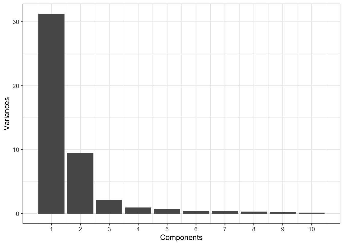
round(sp_pca1$loadings[, 1:2], 3) Comp.1 Comp.2
GOOGL 0.781 0.609
AMZN 0.593 -0.792
AAPL 0.078 0.004
MSFT 0.029 0.002
CSCO 0.017 -0.001
INTC 0.020 -0.001
CVX 0.068 -0.021
XOM 0.053 -0.005
SLB 0.079 -0.013
COP 0.044 -0.016
JPM 0.043 0.001
WFC 0.034 -0.001
USB 0.026 0.003
AXP 0.063 -0.006
WMT 0.026 -0.001
TGT 0.036 -0.010
HD 0.051 -0.019
COST 0.061 -0.019Categorical Data and Gower’s Distance
x <- loan_data[1:5, c("dti", "payment_inc_ratio", "home_", "purpose_")]
x
# A tibble: 5 × 4
dti payment_inc_ratio home_ purpose_
<dbl> <dbl> <fct> <fct>
1 1 2.39 RENT major_purchase
2 5.55 4.57 OWN small_business
3 18.1 9.72 RENT other
4 10.1 12.2 RENT debt_consolidation
5 7.06 3.91 RENT other daisy(x, metric = "gower")Dissimilarities :
1 2 3 4
2 0.6220479
3 0.6863877 0.8143398
4 0.6329040 0.7608561 0.4307083
5 0.3772789 0.5389727 0.3091088 0.5056250
Metric : mixed ; Types = I, I, N, N
Number of objects : 5set.seed(1234)
defaults <- loan_data %>%
filter(outcome == "default")
df <- defaults[sample(nrow(defaults), 250),
c("dti", "payment_inc_ratio", "home_", "purpose_")]
d <- daisy(df, metric = "gower")
hcl <- hclust(d)
dnd <- as.dendrogram(hcl)
plot(dnd, leaflab = "none", ylab = "distance")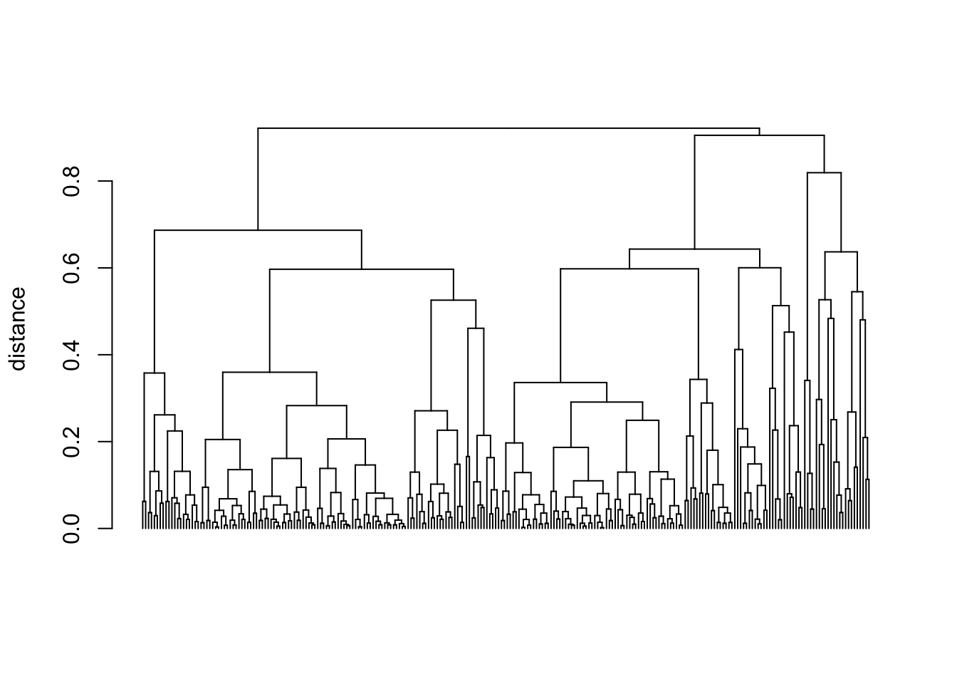
plot(dnd, leaflab = "none", ylab = "distance")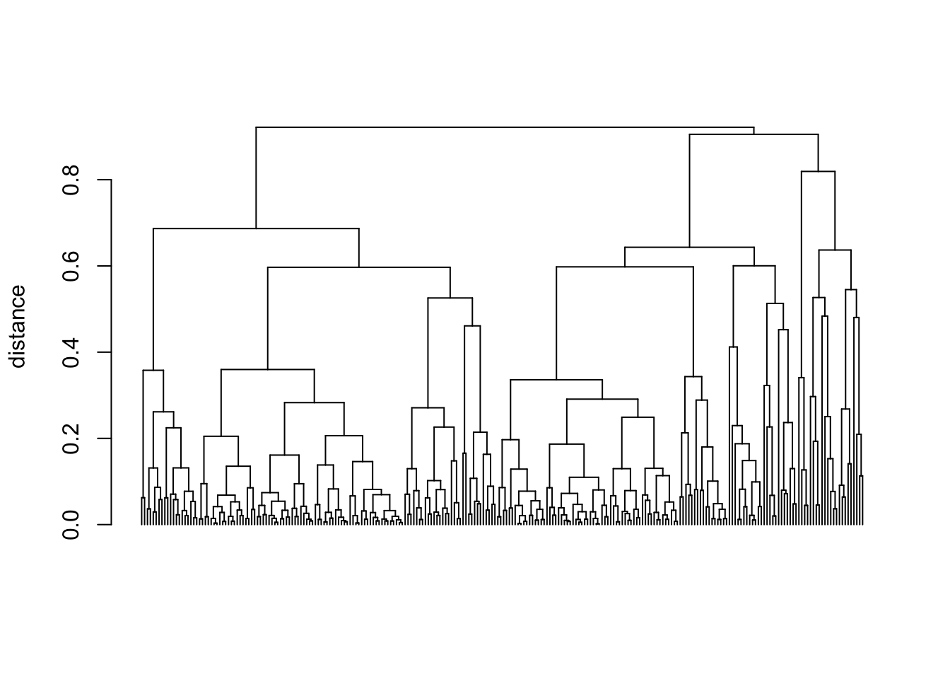
dnd_cut <- cut(dnd, h = 0.5)
df[labels(dnd_cut$lower[[1]]), ]
# A tibble: 20 × 4
dti payment_inc_ratio home_ purpose_
<dbl> <dbl> <fct> <fct>
1 3.61 3.60 RENT other
2 0 0.711 RENT other
3 25.5 14.0 RENT other
4 28.4 12.8 RENT other
5 25.4 4.06 RENT other
6 25.2 6.35 RENT other
7 27.5 9.75 RENT other
8 30.1 6.61 RENT other
9 16.4 12.0 RENT other
10 15.4 16.5 RENT other
11 20.4 7.04 RENT other
12 21.3 1.91 RENT other
13 19.7 4.31 RENT other
14 17.0 4.04 RENT other
15 14.5 2.58 RENT other
16 11.8 1.98 RENT other
17 10.0 2.58 RENT other
18 9.87 4.55 RENT other
19 16.0 5.27 RENT other
20 13.9 5.26 RENT other Problems with Clustering Mixed Data
df <- model.matrix(~ -1 + dti + payment_inc_ratio + home_ + pub_rec_zero,
  data = defaults)
df0 <- scale(df)
km0 <- kmeans(df0, centers = 4, nstart = 10)
centers0 <- scale(km0$centers, center = FALSE,
  scale = 1 / attr(df0, "scaled:scale"))
round(scale(centers0, center = - attr(df0, "scaled:center"), scale = FALSE), 2)
dti payment_inc_ratio home_MORTGAGE home_OWN home_RENT pub_rec_zero
1 17.20 9.27 0.00 1 0.00 0.92
2 17.46 8.42 1.00 0 0.00 1.00
3 16.99 9.11 0.00 0 1.00 1.00
4 16.50 8.06 0.52 0 0.48 0.00
attr(,"scaled:scale")
dti payment_inc_ratio home_MORTGAGE home_OWN
0.1305561 0.2286345 2.0190809 3.6191450
home_RENT pub_rec_zero
2.0008117 3.5722842
attr(,"scaled:center")
dti payment_inc_ratio home_MORTGAGE home_OWN
-17.1521684 -8.7700843 -0.4313440 -0.0832782
home_RENT pub_rec_zero
-0.4853778 -0.9142958 Supplementary Material
Figure 7-4. Graphical representation of a correspondence analysis of house task data
set.seed(1234)
contrib <- ca_analysis$sv ** 2
contrib <- contrib / sum(contrib)
colcoord <- as.data.frame(ca_analysis$colcoord)
rowcoord <- as.data.frame(ca_analysis$rowcoord)
coords <- bind_rows(
  rowcoord %>% mutate(type = "rowcoord"),
  colcoord %>% mutate(type = "columns")
)
row.names(coords) <- gsub("_", " ", row.names(coords))

graph <- ggplot(coords, aes(x = Dim1, y = Dim2, color = type,
    label = rownames(coords), shape = type)) +
  geom_hline(yintercept = 0, linetype = "dotted", color = "#444444") +
  geom_vline(xintercept = 0, linetype = "dotted", color = "#444444") +
  geom_point() +
  geom_text_repel() +
  xlab(sprintf("Dimension 1 (%.1f%%)", 100 * contrib[1])) +
  ylab(sprintf("Dimension 2 (%.1f%%)", 100 * contrib[2])) +
  scale_color_manual(values = c("blue", "red")) +
  theme_bw() +
  theme(legend.position = "none")
graph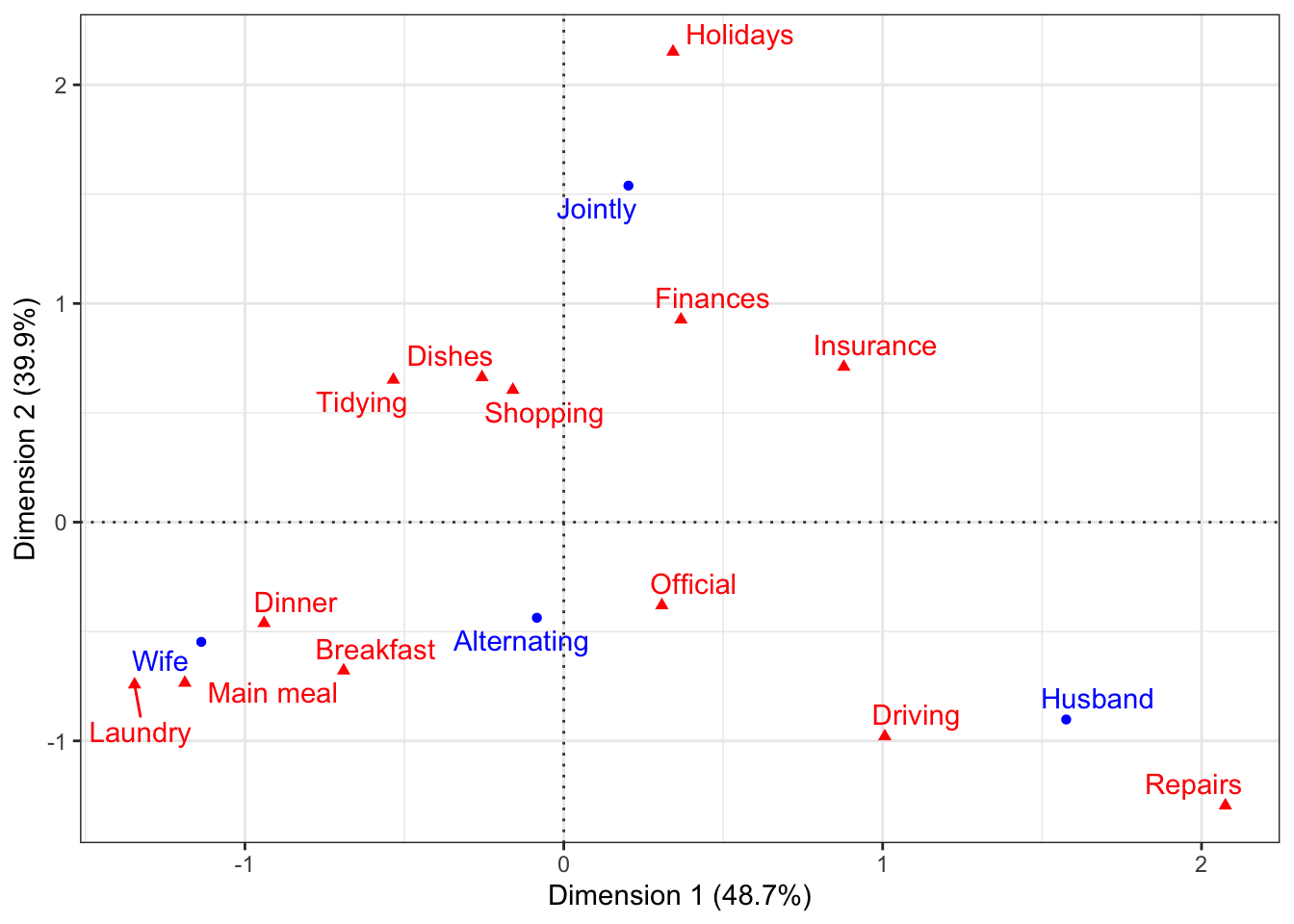
Figure 7-5. The clusters of K-means applied to daily stock returns for ExxonMobil and Chevron
set.seed(1010103)
df <- sp500_px %>%
  filter(Date >= "2011-01-01") %>%
  select(XOM, CVX)
km <- kmeans(df, centers = 4, nstart = 1)
df <- df %>% mutate(cluster = factor(km$cluster))
centers <- as.tibble(km$centers) %>%
  mutate(cluster = factor(1:4))
Warning: `as.tibble()` was deprecated in tibble 2.0.0.
ℹ Please use `as_tibble()` instead.
ℹ The signature and semantics have changed, see `?as_tibble`.ggplot(df, aes(x = XOM, y = CVX, color = cluster, shape = cluster)) +
geom_point() +
scale_shape_manual(
values = c(1, 3, 2, 4),
guide = guide_legend(override.aes = aes(size = 1))
) +
geom_point(data = centers, aes(x = XOM, y = CVX), size = 2, stroke = 2, color = "black") +
coord_cartesian(xlim = c(-2, 2), ylim = c(-2.5, 2.5)) +
scale_x_continuous(expand = c(0, 0)) +
scale_y_continuous(expand = c(0, 0))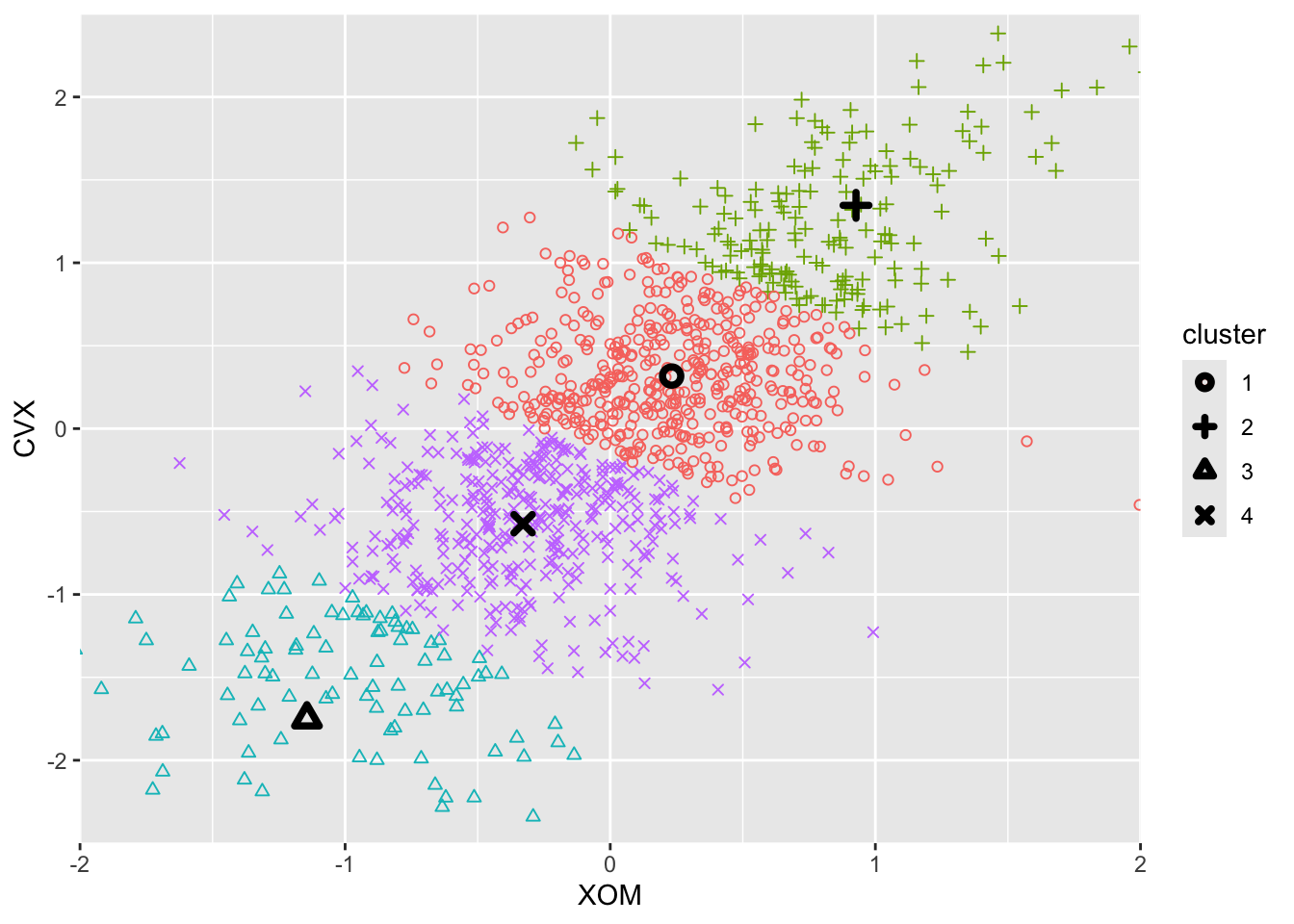
Figure 7-9. A comparison of measures of dissimilarity applied to stock data
cluster_fun <- function(df, method) {
  d <- dist(df)
  hcl <- hclust(d, method = method)
  tree <- cutree(hcl, k = 4)
  return(df %>% mutate(cluster = factor(tree), method = method))
}

df0 <- sp500_px %>%
  filter(Date >= "2011-01-01") %>%
  select(XOM, CVX)
df <- bind_rows(
  cluster_fun(df0, method = "single"),
  cluster_fun(df0, method = "average"),
  cluster_fun(df0, method = "complete"),
  cluster_fun(df0, method = "ward.D")
)
df$method <- ordered(df$method, c("single", "average", "complete", "ward.D"))

graph <- ggplot(data = df, aes(x = XOM, y = CVX, color = cluster, shape = cluster)) +
  geom_point(alpha = 0.6) +
  scale_shape_manual(
    values = c(1, 3, 4, 2),
    guide = guide_legend(override.aes = aes(size = 2))
  ) +
  facet_wrap(~ method)
graph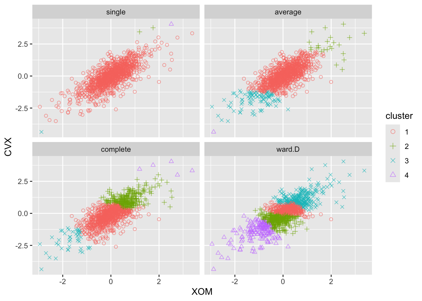
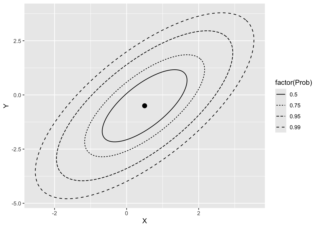
Figure 7-10. Probability contours for a two-dimensional normal distribution
mu <- c(0.5, -0.5)
sigma <- matrix(c(1, 1, 1, 2), nrow = 2)
prob <- c(0.5, 0.75, 0.95, 0.99) ## or whatever you want
names(prob) <- prob ## to get id column in result
df <- tibble()
for (p in prob){
  df <- bind_rows(
    df,
    as.tibble(ellipse(x = sigma, centre = mu, level = p)) %>%
      mutate(prob = p)
  )
}
names(df) <- c("X", "Y", "Prob")

## Figure 7-9: Multivariate normal ellipses
dfmu <- tibble(X = mu[1], Y = mu[2])

graph <- ggplot(df, aes(X, Y)) +
  geom_path(aes(linetype = factor(Prob))) +
  geom_point(data = dfmu, aes(X, Y), size = 3)
graph